10 Earth Tone Interior Color Palettes That Make a Home Feel Instantly Cozier

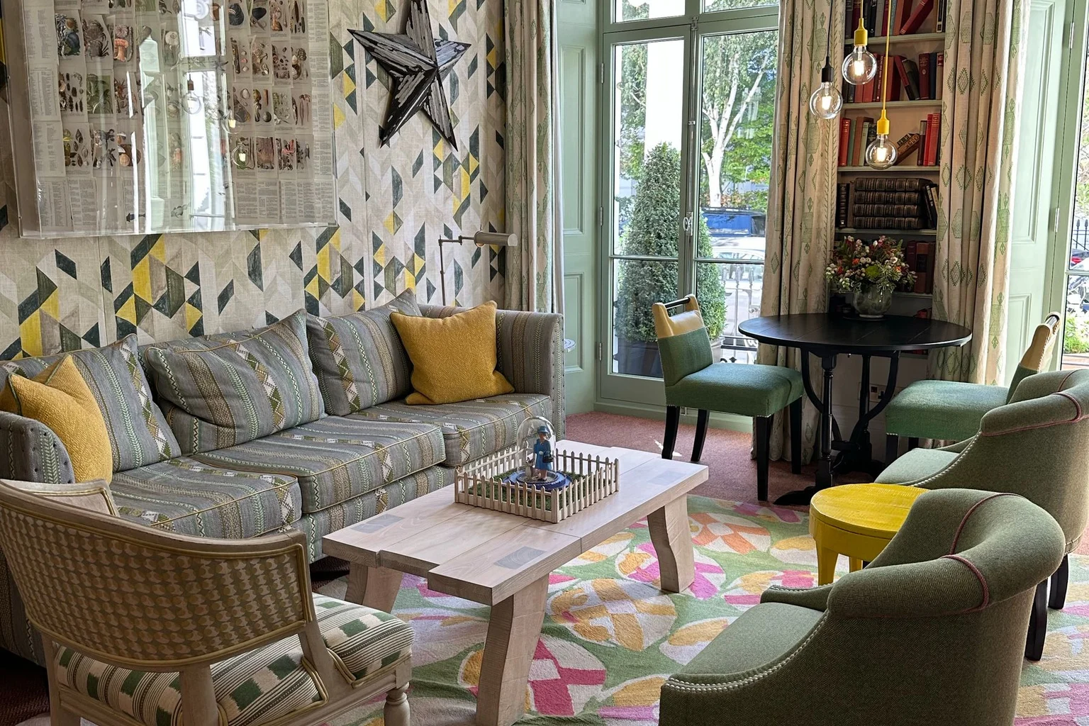
An earth tone interior color palette brings together colors inspired by soil, stone, wood, and plants, from sandy beige and warm brown to sage green and terracotta. The goal is a home that feels comfortable and connected, with colors that sit naturally alongside your furniture and everyday belongings.
The quick answer
- Combine a light background, an earthy main color, and a deeper accent for a balanced palette.
- Ivory, sage, and pale oak create a gentle combination; sand, terracotta, and walnut add richer warmth.
- Wood grain, woven fabric, and ceramics add texture without requiring more colors.
You can carry those colors through paint, furniture, curtains, or a few smaller accessories. These ten palettes show where each shade belongs and how to make the combination work with the room you already have.
What Actually Counts as an Earth Tone?
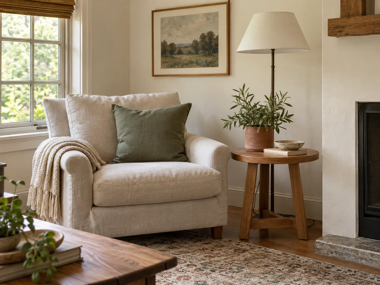
Earth tones are muted colors associated with the natural world. Beige and brown are familiar examples, but the family also includes mossy green, rusty red, golden ochre, and softer stone-inspired blues.
Think about a woodland path: pale stones, dark bark, green leaves, and reddish soil. There is plenty of color, yet the shades feel comfortable together.
| Color family | Shades to use |
|---|---|
| Brown | Camel, cognac, walnut, cocoa, espresso |
| Green | Sage, olive, moss, forest |
| Clay | Terracotta, rust, muted brick |
| Light neutral | Ivory, oatmeal, sand, mushroom, taupe |
| Supporting color | Ochre, dusty rose, muted stone blue |
Wood, leather, stone, and metal already contribute to your palette. A walnut-finish table brings brown into the room, while a leather chair adds its own warm tone.
Before buying anything, count those existing colors. You may already have half the combination in place.
Find Your Earth Tone Palette at a Glance
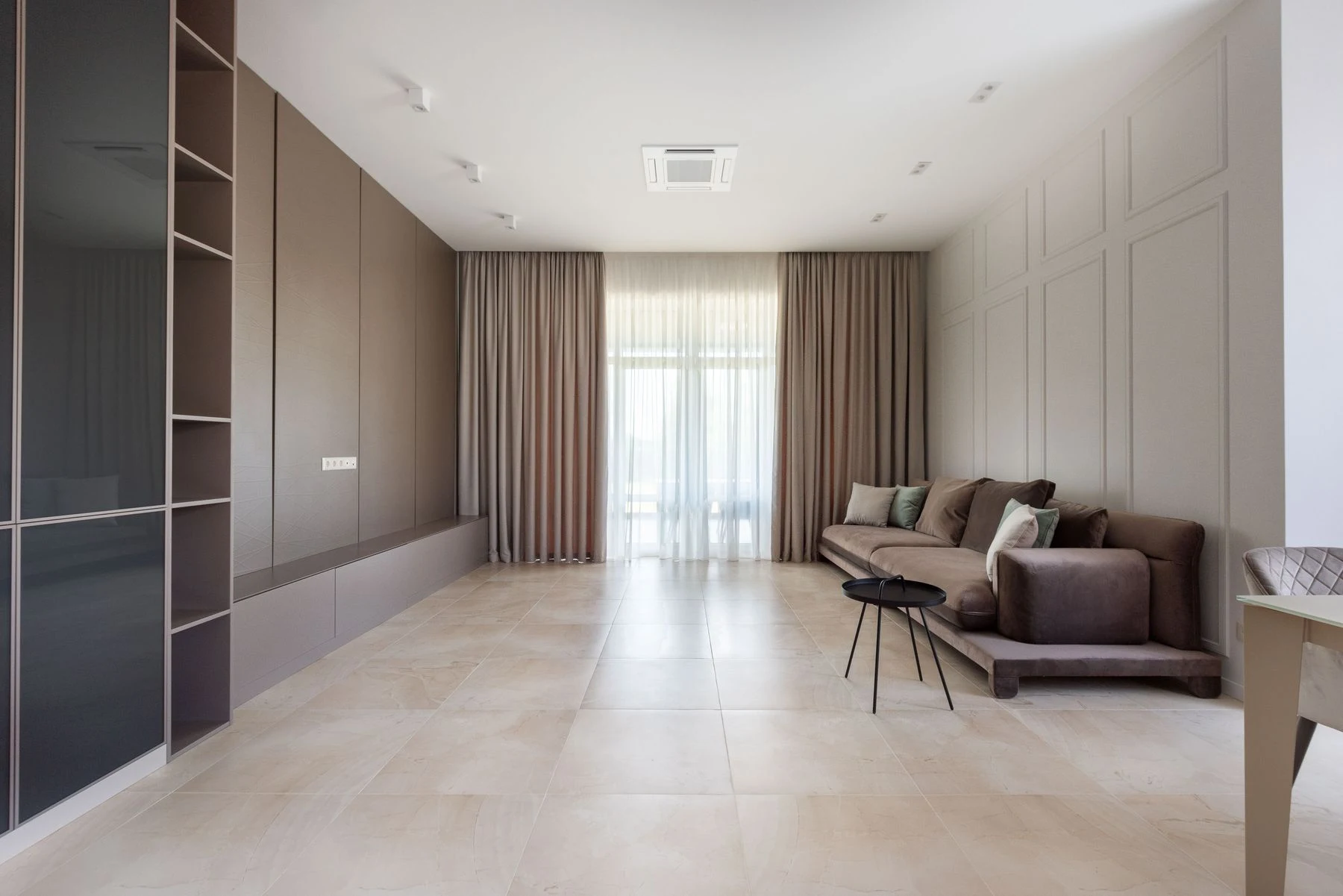
Choose a palette that works with your largest existing pieces. Your sofa, flooring, and cabinetry occupy much more space than the cushions you might add later.
| Palette | Overall feel | Where it works especially well |
|---|---|---|
| Ivory, sage, and pale oak | Light and relaxed | Living room or bedroom |
| Sand, terracotta, and walnut | Warm and grounded | Living room or dining room |
| Cream, olive, and cognac | Rich and comfortable | Reading corner or lounge |
| Mushroom, cocoa, and ivory | Soft and understated | Bedroom |
| Oatmeal, ochre, and clay | Sunny and expressive | Dining nook or entryway |
| Dusty rose, taupe, and espresso | Gentle with depth | Bedroom or sitting room |
| Stone blue, tan, and walnut | Balanced and airy | Living room or home office |
| Forest green, cream, and bronze | Deep and enveloping | Office or snug |
| Rust, mushroom, and charcoal | Earthy with definition | Living room |
| Warm white, stone, and weathered wood | Quiet and textured | Bedroom or bathroom |
1. Ivory, Sage, and Pale Oak for an Easygoing Room
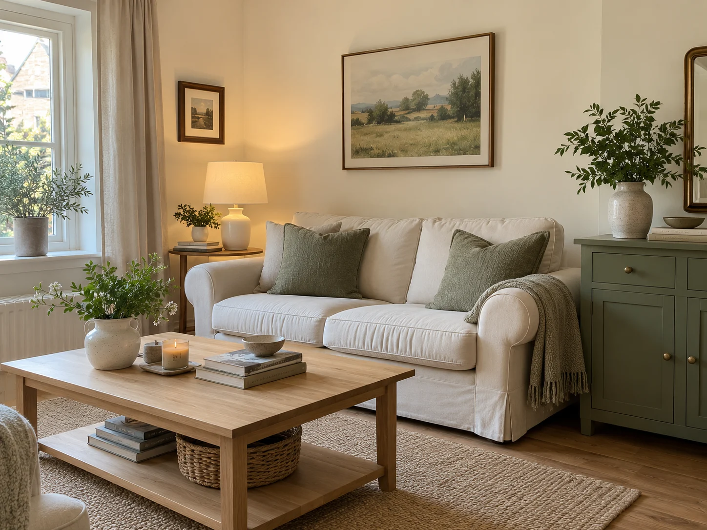
Use ivory for the background, sage for your main accent, and pale oak to connect the two. This combination brings color into a room while keeping the overall look gentle.
Ivory walls and an oak side table give sage a comfortable setting. You can introduce the green through a chair, curtains, or a painted piece of furniture.
For an existing cabinet or dresser, Heirloom Traditions ALL-IN-ONE Paint in Simply Sage adds a muted gray-green note. Keep the surrounding surfaces lighter so the painted piece has a clear place in the room.
Prefer a smaller change? MIULEE Sage Green Corduroy Pillow Covers bring the color directly onto a cream sofa. Their ribbed texture adds interest alongside smoother upholstery, and the set includes two covers for 18-inch inserts.
Let sage appear in more than one place. A cushion and a small detail in artwork can connect the room without requiring green furniture throughout.
Our sage green palette guide explores more ways to build supporting colors around it.
2. Sand, Terracotta, and Walnut for Sunbaked Warmth
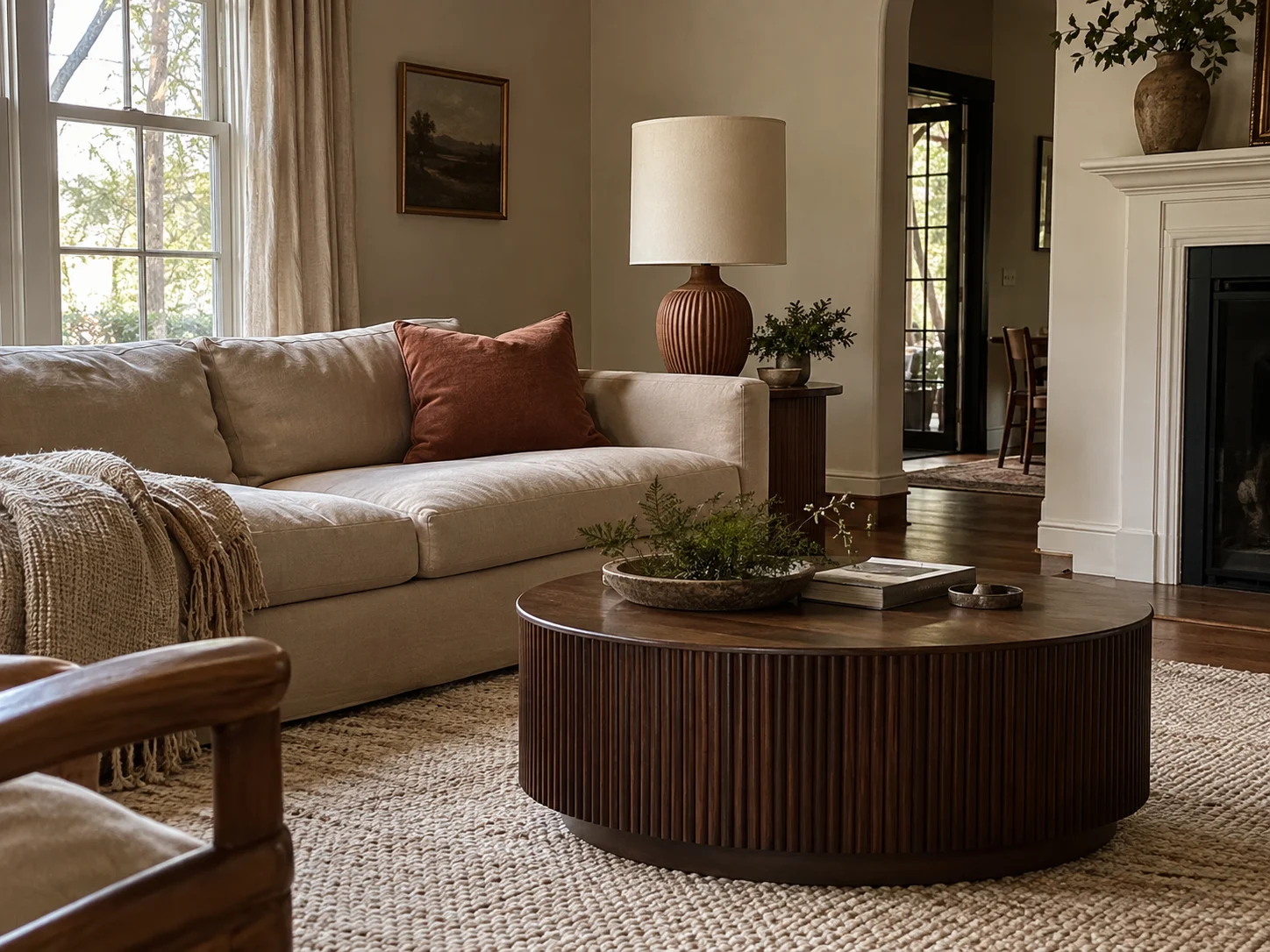
Let sand cover the larger surfaces, terracotta bring warmth, and walnut provide depth. This is a useful combination when you already own a beige sofa and want the room to feel more complete.
The USumkky Terracotta Brown Ceramic Table Lamp carries that clay-colored warmth onto a side table or console. Its brown ceramic base and linen drum shade connect the stronger accent with the lighter background.
Bring the deeper brown into the center of the seating area with the JOINICE 31.5-Inch Round Coffee Table in Walnut. The walnut finish gives pale upholstery some contrast, while the fluted sides introduce texture.
Keep larger textiles cream or oatmeal. A terracotta lamp, one rust cushion, and a small clay bowl can provide plenty of warmth without spreading orange across every surface.
Repeat terracotta selectively and give the darker furniture room to stand out.
3. Cream, Olive, and Cognac for a Collected Look
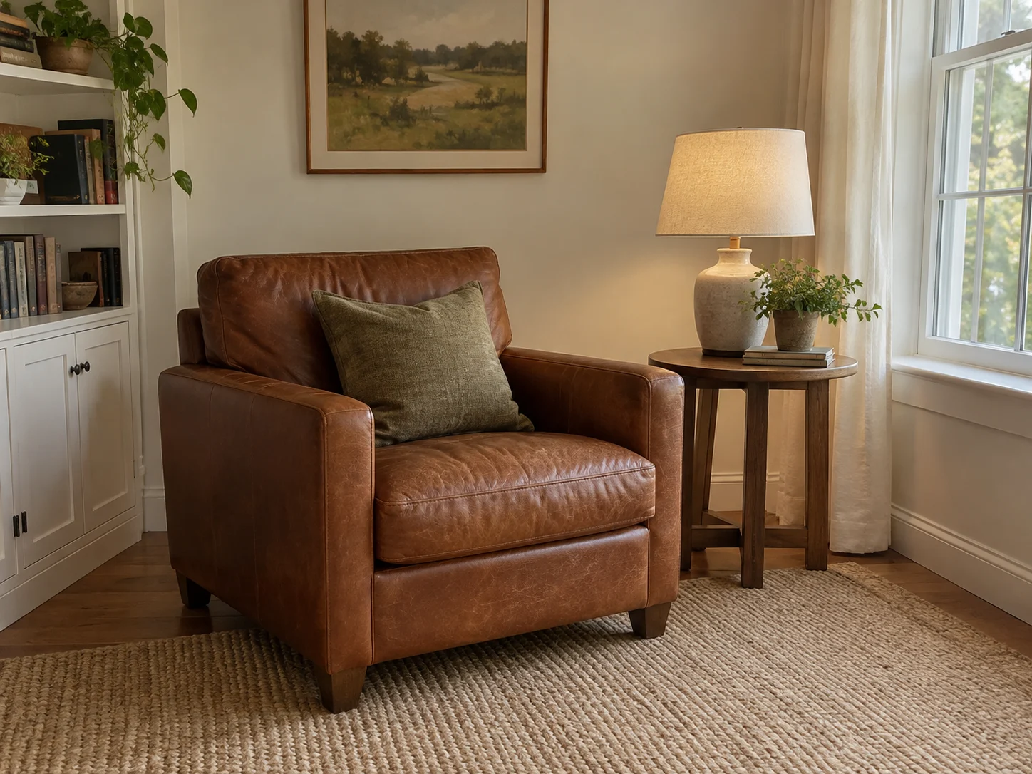
Use cream as the backdrop, cognac as the warm centerpiece, and olive as the supporting color. A brown leather sofa or favorite armchair can become the foundation of this palette.
Add olive cushions or a throw, then use lighter textiles around the seating. Cream curtains and a pale rug keep the leather and green from feeling too heavy together.
The SAFAVIEH Natural Fiber NF143C Rug in Marble and Beige gives this arrangement a neutral woven base. Its sisal texture introduces a different surface beside smooth leather and fabric.
That variation matters. A room with leather, woven fibers, and wood has plenty of visual interest even when the colors stay restrained.
Keep a generous area light, whether through the walls, curtains, or flooring. Cream gives the richer colors enough space to remain distinct.
4. Mushroom, Cocoa, and Ivory for a Softer Bedroom
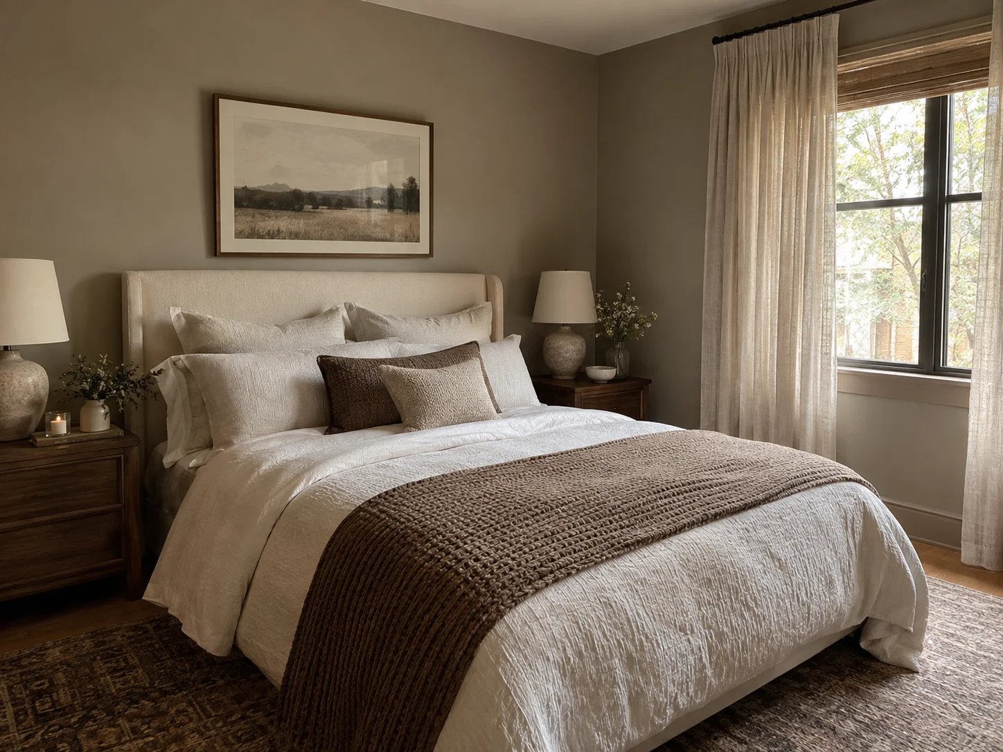
Use mushroom through the middle tones, ivory for lightness, and cocoa for definition. The combination works particularly well in a bedroom where you want a quieter look.
Try ivory bedding, mushroom-colored walls, and cocoa bedside tables. A brown throw at the foot of the bed repeats the deeper shade without making the whole room dark.
For the window, MYSKY HOME Semi-Sheer Linen-Blend Curtains add a pale neutral layer and visible woven texture. Their light-filtering fabric suits an airy daytime look.
A bedroom also needs the right level of light control. Pair semi-sheer panels with a blackout shade when darkness matters for sleep. Our linen blackout curtain guide covers options for that job.
Keep the main color differences easy to see. If the bedding, curtains, rug, and headboard all sit at the same depth of beige, a cocoa accent can make the arrangement feel clearer.
5. Oatmeal, Ochre, and Clay for a Cheerful Earthy Scheme
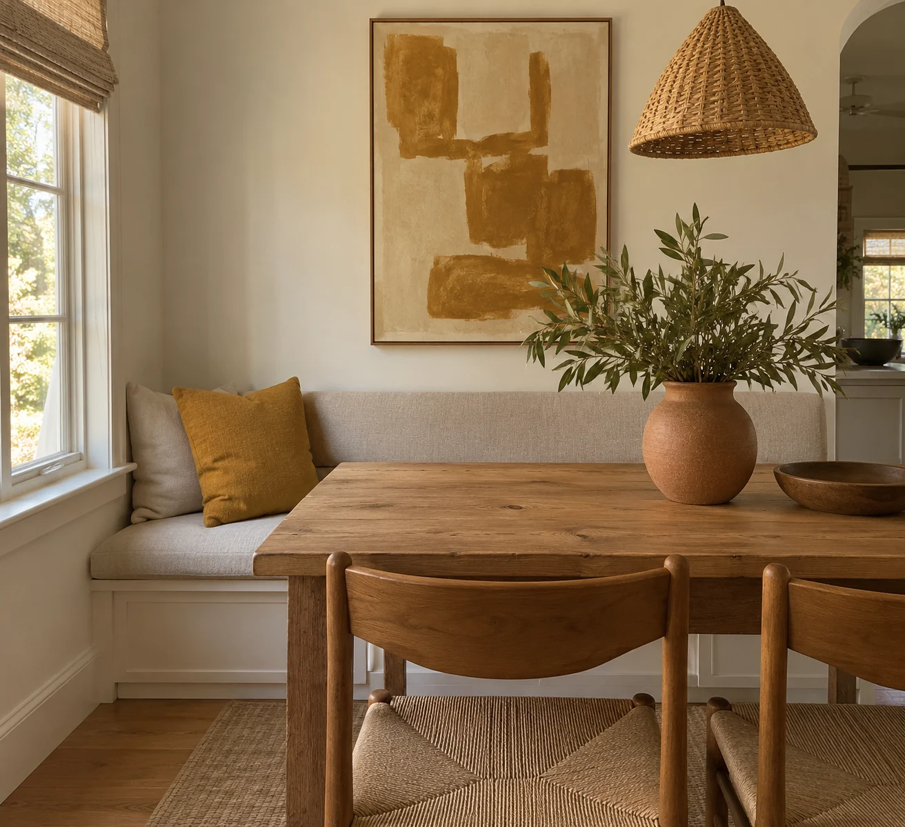
Keep oatmeal dominant, then use ochre and clay as smaller accents. This gives the room a cheerful lift while preserving a comfortable neutral background.
An oatmeal dining bench could take an ochre cushion, with a clay vase on the table. In an entryway, use a pale runner, golden-toned artwork, and a terracotta planter.
Ochre has a muted, earthy depth that works well beside natural wood. A little can have a noticeable effect, especially in an otherwise neutral room.
If you already have a terracotta lamp or ceramic pot, repeat that color in the artwork rather than adding several more orange objects.
Let one warm accent lead. A large ochre print needs only a few smaller clay-colored details around it.
6. Dusty Rose, Taupe, and Espresso for Gentle Color
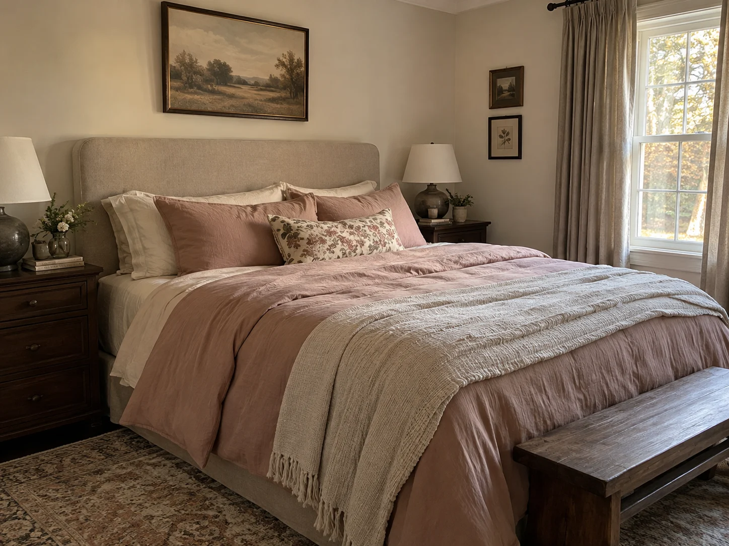
Pair dusty rose with taupe and a small amount of espresso brown. The pink brings gentle color, taupe connects the larger surfaces, and the darker brown gives everything definition.
For a bedroom, use dusty rose bedding, taupe curtains, and espresso bedside furniture. In a sitting room, a pink throw over a neutral chair can create the same effect on a smaller scale.
A patterned cushion containing rose, taupe, and brown can help connect the shades. Keep the pattern relatively quiet if the rest of the room already has strong wood grain or textured walls.
The dark brown works like the outline around a soft watercolor. A little makes the lighter areas easier to see.
Give the pink room to remain gentle by keeping the deepest brown to a few clear accents.
7. Stone Blue, Tan, and Walnut for a Fresher Balance
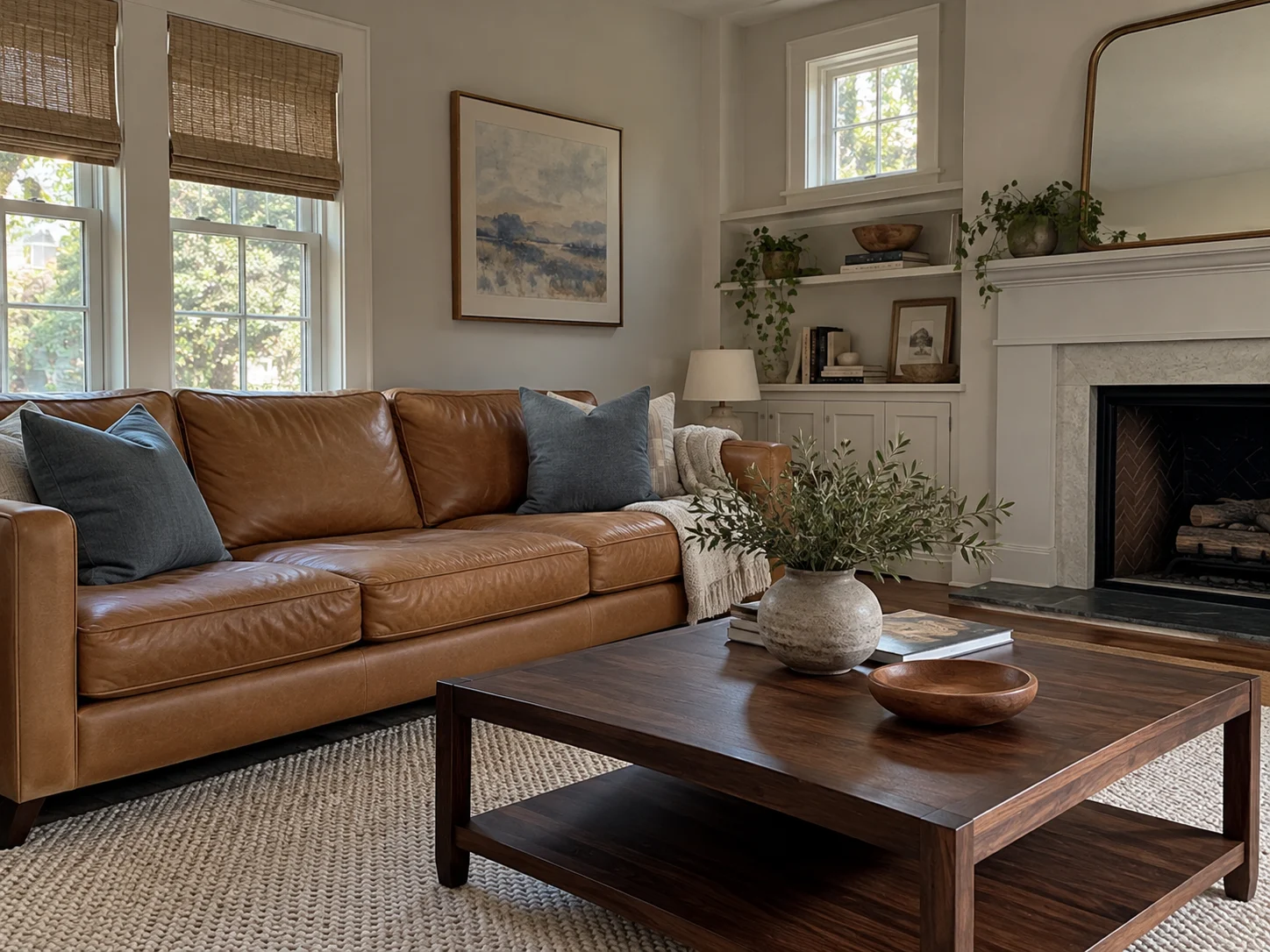
Use stone blue to balance the warmth of tan and walnut. This combination is especially useful when your room already contains golden flooring or caramel-colored leather.
A tan sofa and walnut-finish table create a warm foundation. Add blue-gray cushions, a pale rug, and artwork that repeats the blue.
The JOINICE coffee table introduced earlier also fits this arrangement. Its deeper brown finish separates the center of the room from lighter upholstery, while blue textiles change the overall mood.
Choose a softened blue with some gray in it. A dusty shade sits comfortably beside muted brown and woven neutrals.
Think of the color mix as a rocky shoreline: warm sand, weathered timber, and quieter blue water. Each shade has a place, even though their temperatures differ.
8. Forest Green, Cream, and Bronze for a Cozy Retreat
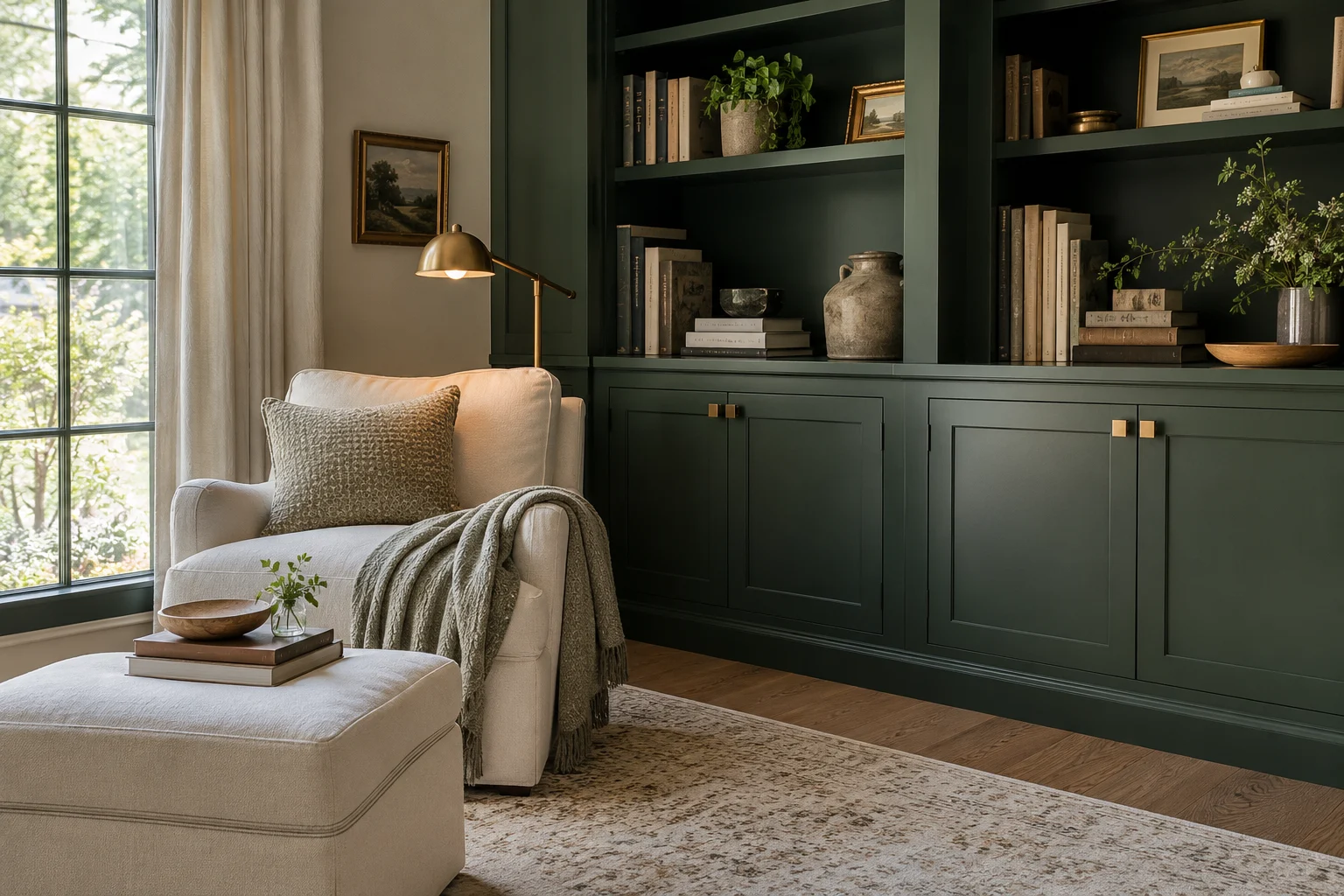
Balance forest green with cream furnishings and a few warm bronze accents. This works well in a reading corner, home office, or room with built-in storage.
Green cabinetry behind a cream chair creates depth without making every surface dark. A pale rug adds another area of relief, while metal details give the eye something smaller to notice.
On cabinetry, Ravinte Champagne Bronze Square Cabinet Handles introduce a lighter, golden bronze finish. That warm accent stands out against deep green and also works alongside cream or wood finishes.
You can carry a similar warm metal tone into a lamp or picture frame. A few repeated details are enough to make the finish feel connected.
Give dark green useful light around it. A reading lamp beside the chair and general room lighting make the space comfortable after sunset.
9. Rust, Mushroom, and Charcoal for More Definition
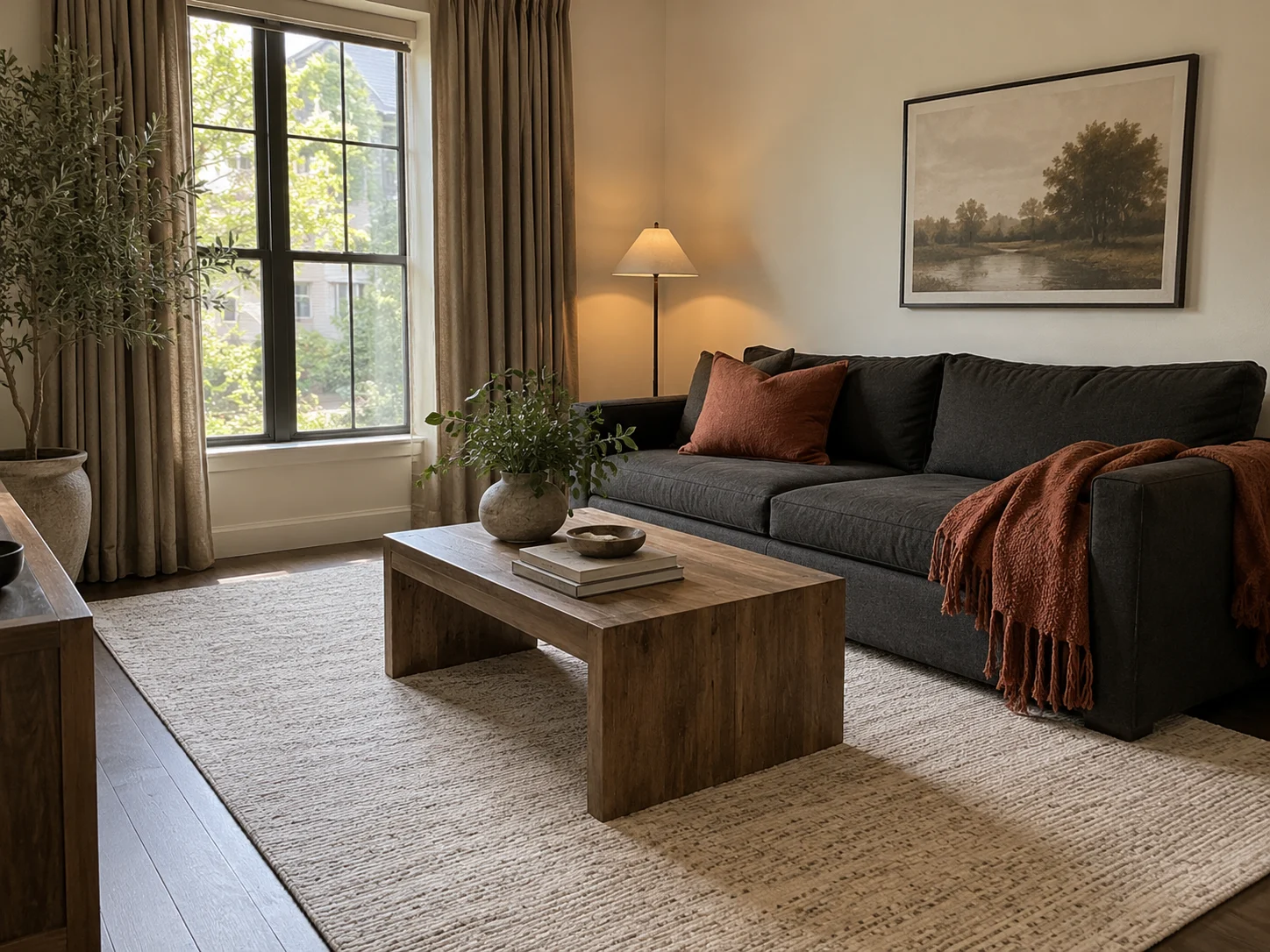
Use mushroom to connect warm rust with deeper charcoal. It creates a quieter transition between the two stronger colors.
If you already own a charcoal sofa, bring in mushroom curtains, a light textured rug, and a rust throw. Repeat charcoal through a slim frame or lamp so the sofa belongs to the whole arrangement.
Rust is especially effective directly against the upholstery. A cushion or throw puts the warmer color where it makes the biggest difference.
Keep some space between the dark sofa and a dark floor. A pale rug helps separate them, giving the seating area a clearer outline.
A larger light-colored surface will do more than several tiny pale accessories. Curtains or a rug can change the balance of the room quickly.
10. Warm White, Stone, and Weathered Wood for Quiet Texture
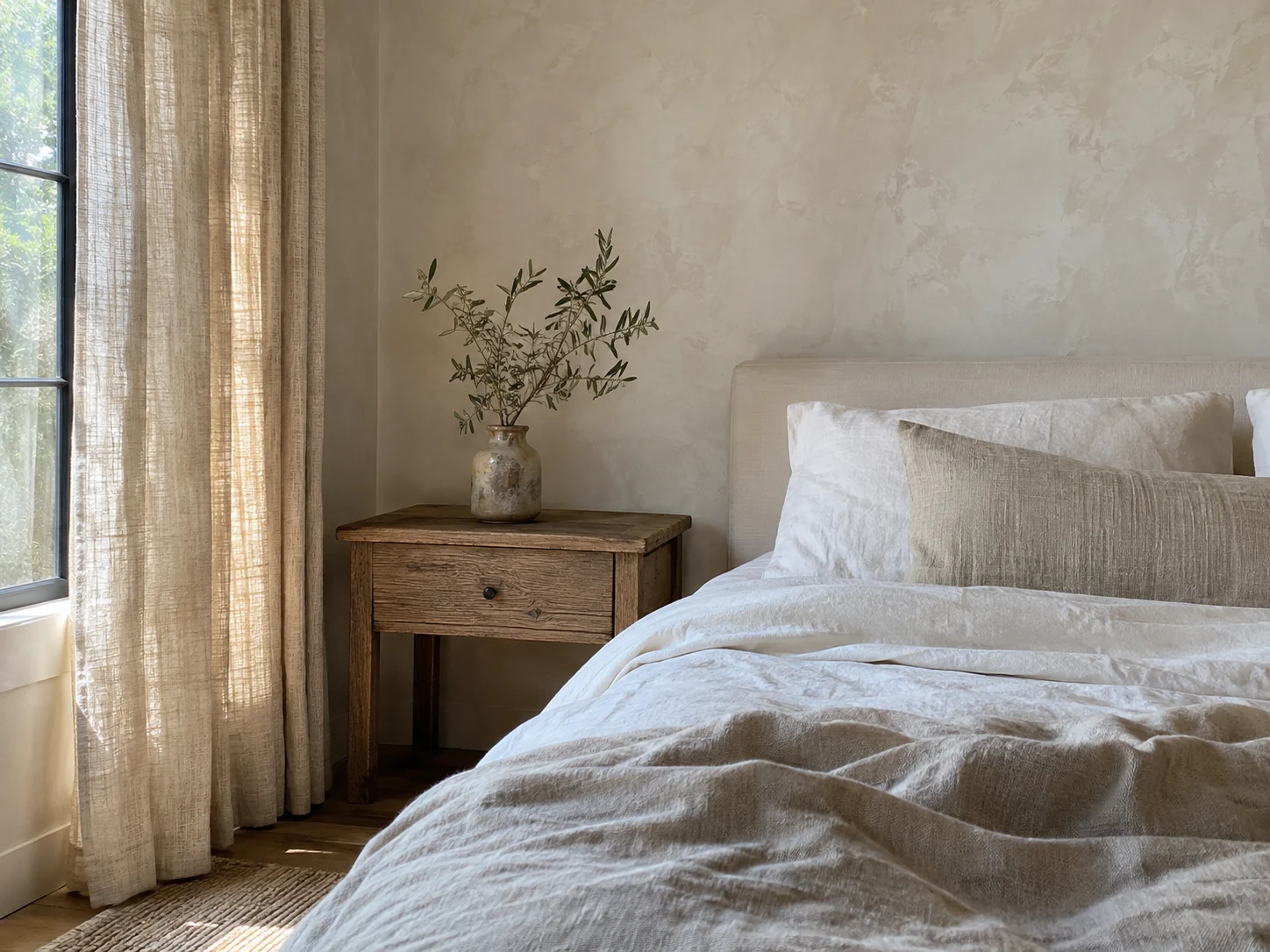
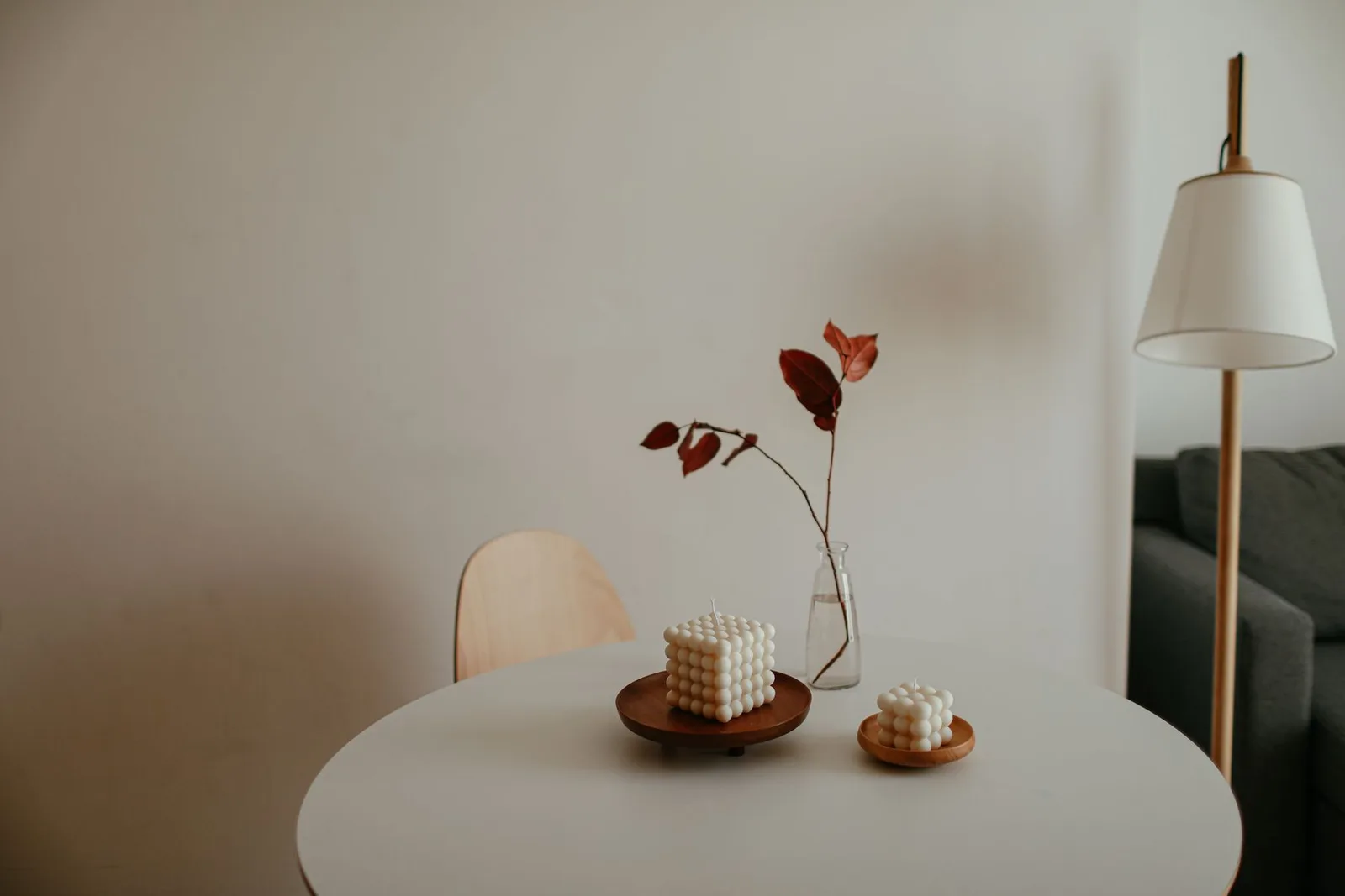
Keep the colors restrained and build interest through texture, grain, and small changes in tone. Warm white, stone, and weathered wood can feel comfortable without needing a strong accent color.
This is where the wall finish can play a bigger role. Meoded Authentic Lime Wash Paint in Fossil creates a matte, mottled finish with a weathered, plaster-like appearance. That variation gives a wall more visual movement within the chosen color.
Pair textured walls with simpler surrounding pieces. Pale curtains, smooth bedding, and wood furniture let the finish remain visible without crowding it.
Keep the surfaces varied: woven fabric beside smooth ceramic, wood grain beside a matte wall, and a soft throw over a simple chair.
Note: Limewash has visible tonal variation as part of its finish. That softly uneven appearance contributes to the look of the room.
Our warm minimalism guide offers more ways to make a restrained space feel comfortable and lived in.
How to Make Your Palette Work With What You Own
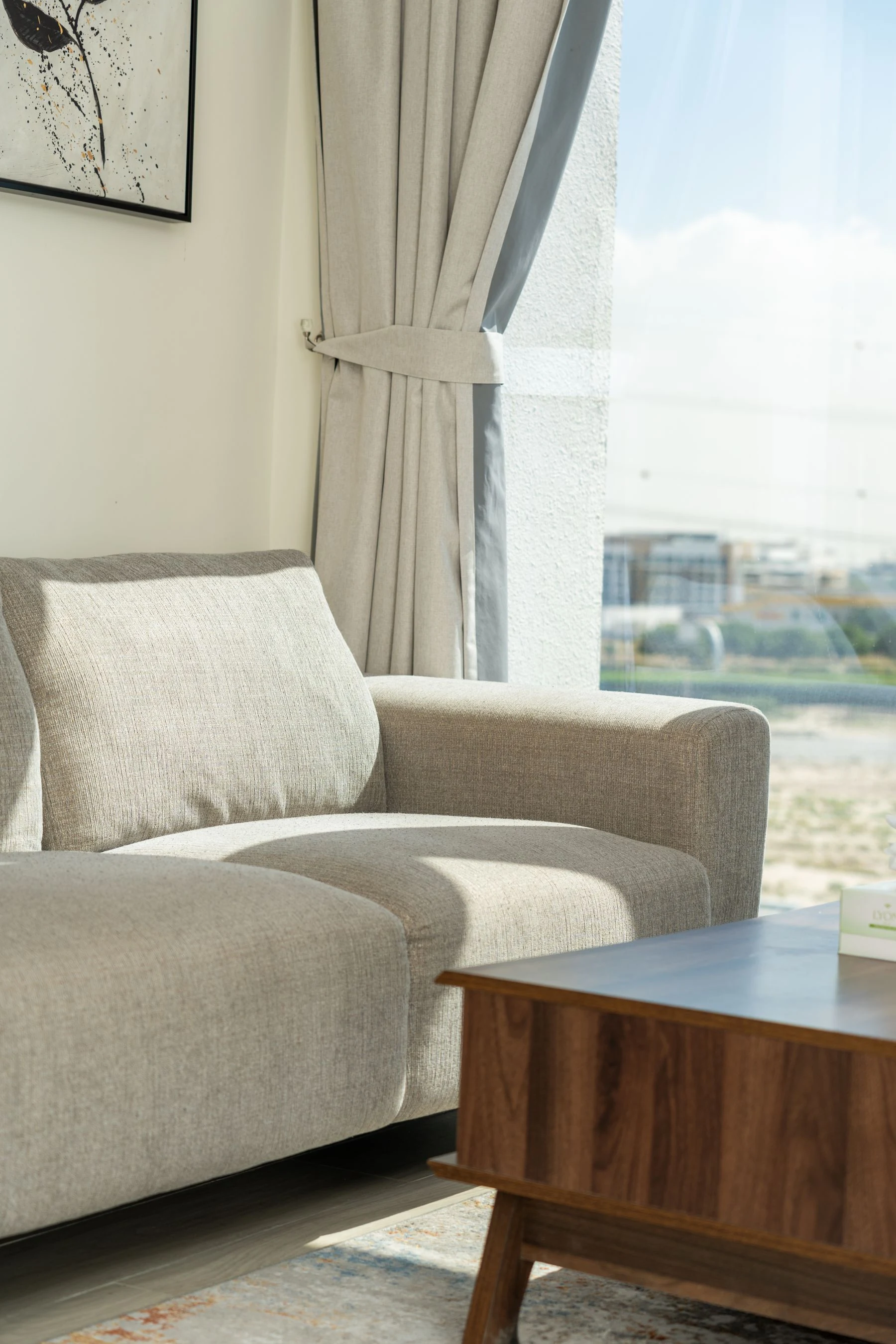
Build around the pieces that occupy the most space and are least likely to change. Flooring, cabinetry, countertops, and large furniture will influence the result more than a handful of new accessories.
Once those colors have a place in the palette, smaller choices become much easier.
Give Every Color a Job
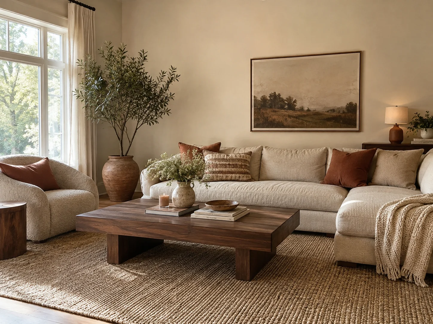
Decide which color belongs in the background, which leads through the furnishings, and which appears in smaller accents.
The familiar 60/30/10 guideline can help you picture the balance: roughly 60 percent background, 30 percent supporting color, and 10 percent accent. Use it loosely.
In a sand, terracotta, and walnut room, sand might appear across the walls and sofa, walnut through the main furniture, and terracotta through the lamp and cushions.
There is no need to calculate the surface area of your curtains. The useful idea is to give some colors more space than others.
Work Around the Biggest Existing Finishes
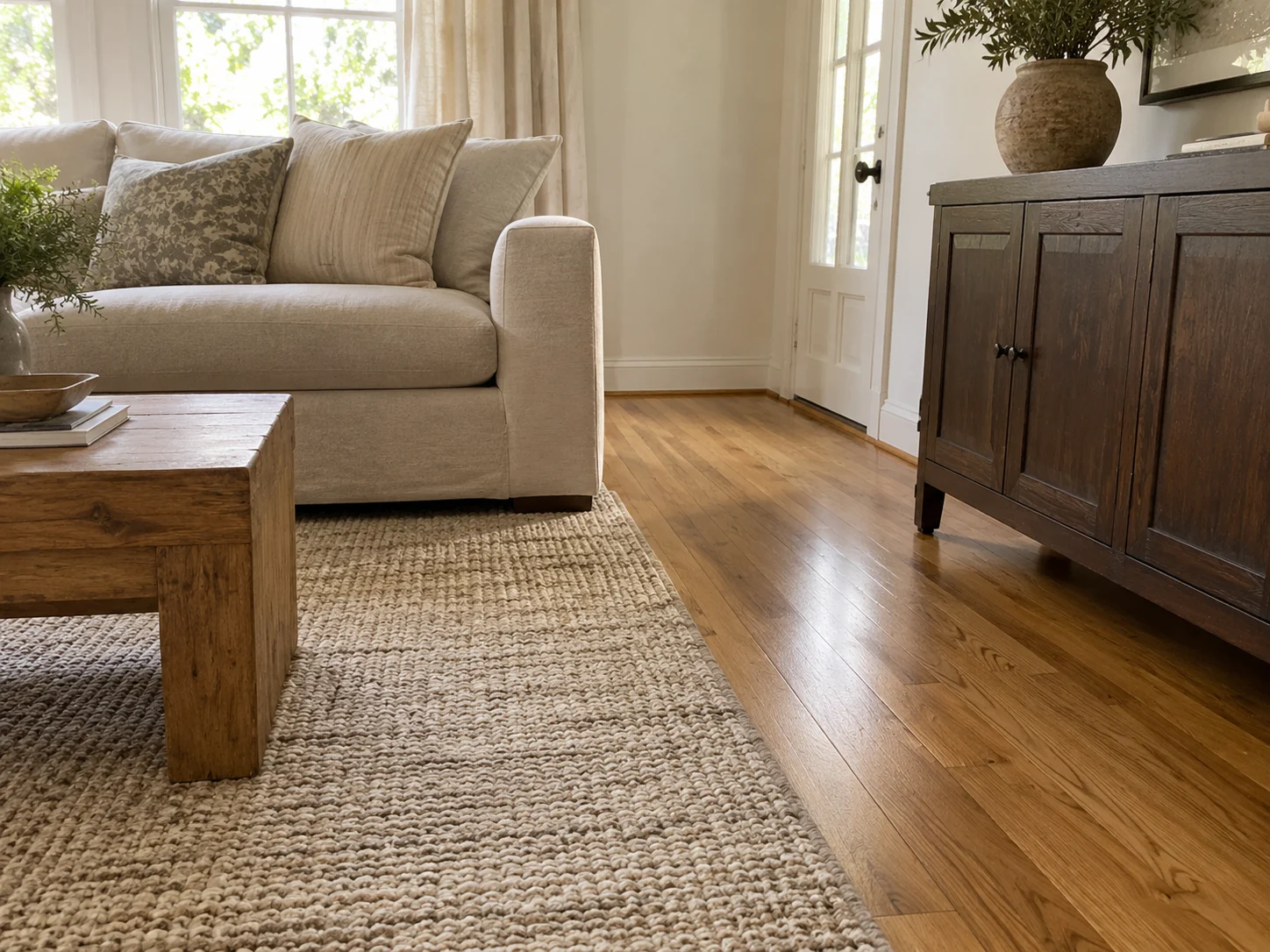
Let permanent finishes influence the colors you add. Golden oak flooring brings warmth across the room, while a charcoal sofa creates a substantial dark area.
Undertones explain why two seemingly similar neutrals can look different together. One beige might lean pink; another might lean yellow. Placed side by side, those quieter colors become more noticeable.
If your room has warm flooring and a sandy sofa, terracotta and brown can continue that warmth. If the room contains gray stone and darker furniture, mushroom, cream, and rust may provide a more natural connection.
Account for the colors already present before introducing another strong shade.
Repeat Colors Through Different Materials
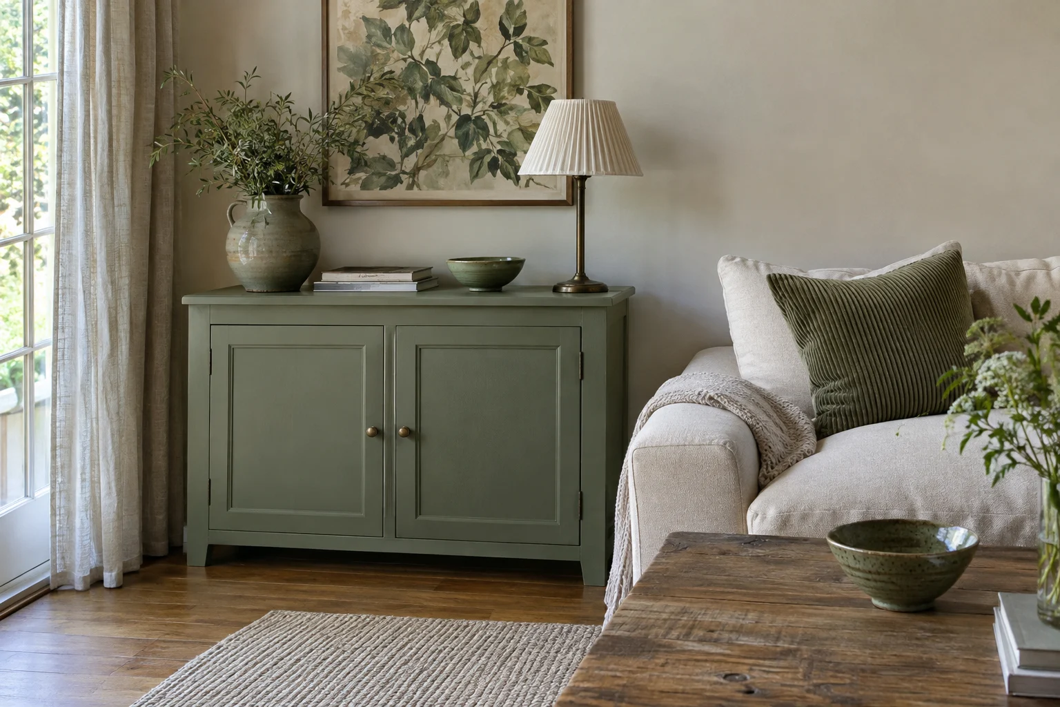
Repeat a color in a few places while changing the material and shape. This creates continuity without requiring matching sets.
A sage-painted cabinet and corduroy cushion covers can relate through their green tones. A small amount of green in artwork gives the color another place to appear.
The shades do not need to be identical. A little variation helps the room feel collected, especially when the colors share a similar softness.
The same approach works with brown: a walnut-finish table, leather chair, and wood frame can connect through their warmth.
Leave Room for Light and Dark
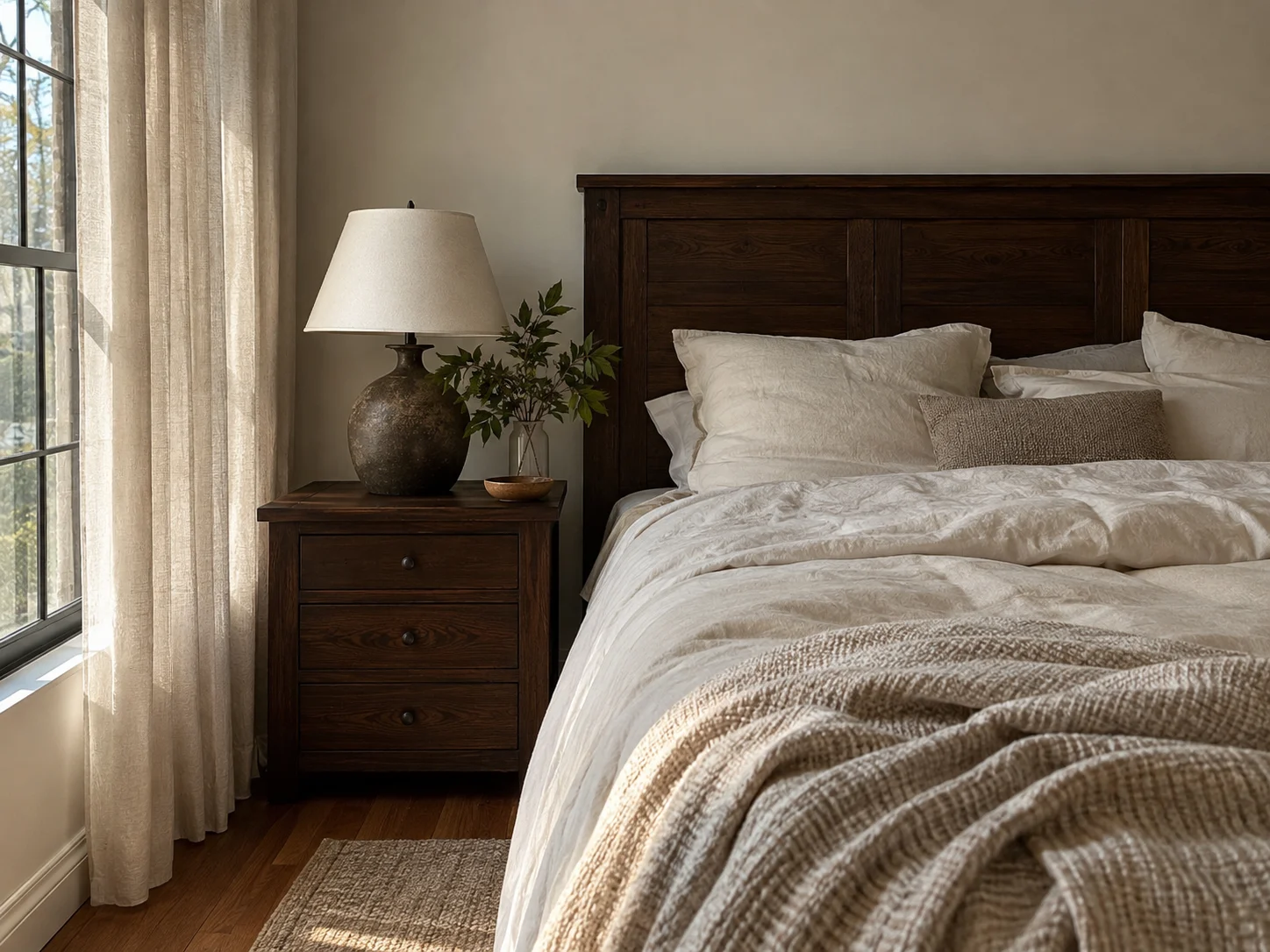
Include a visible difference between your lightest and darkest elements. A room filled with similar middle tones can look flat even when every individual piece is attractive.
Cream curtains beside a dark cabinet create separation. Ivory bedding helps a cocoa headboard stand out. A deep brown table gives a pale seating area definition.
Think of a photograph with very little contrast. The details are there, but they blend together. Rooms can have the same problem.
Our guide to using color without the chaos explains how repetition and clear color roles help keep the balance.
Small Updates That Pull an Earthy Room Together
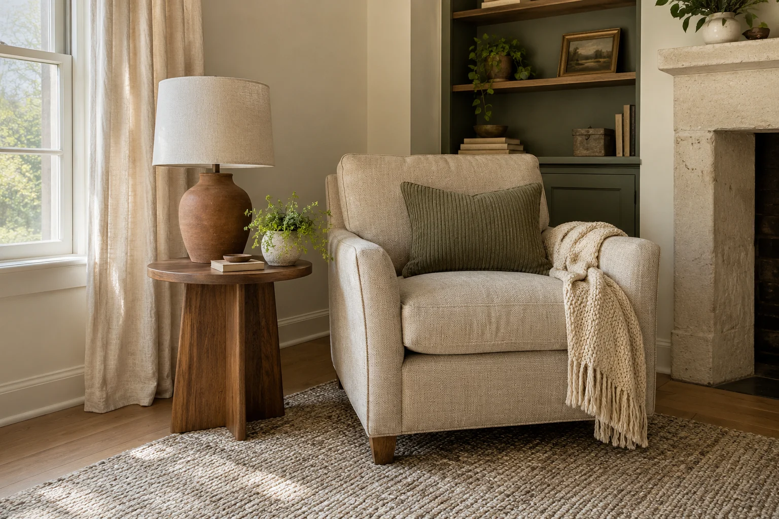
Buy the item that fills a specific gap in the scheme. If the room needs softness, add fabric. If the colors feel disconnected, repeat one. If everything looks pale, introduce a deeper shade.
| What the room needs | A useful update | What it contributes |
|---|---|---|
| A gentle green accent | MIULEE sage pillow covers | Color and ribbed texture on existing seating |
| More clay-colored warmth | USumkky terracotta brown lamp | A warm accent beside pale furniture |
| Deeper brown | JOINICE walnut-finish coffee table | Contrast in the center of the seating area |
| A neutral woven base | SAFAVIEH Marble and Beige rug | Texture beneath richer colors |
| Softer window edges | MYSKY HOME curtains | A pale, light-filtering fabric layer |
| Connected metal details | Ravinte champagne bronze handles | Repeated warm accents across cabinetry |
| Color on existing furniture | Simply Sage paint | A green focal point without replacing the piece |
| More variation on a wall | Meoded Fossil limewash | A matte, softly mottled finish |
You do not need every item in the same room. A lamp and cushion covers may complete one space; a new wall finish may be the main change in another.
Budget note: Keep useful cushion inserts and replace the covers. Move a wood table from another room before buying more furniture. Repeating a color you already own can be enough to make the arrangement feel connected.
Earth Tone Decorating Mistakes and Easy Fixes
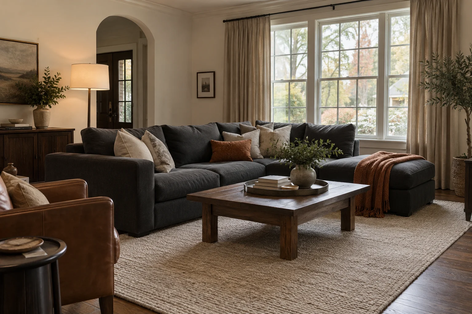
Adjust the balance before replacing the whole scheme. One missing light tone, repeated color, or textured surface can make a room feel unfinished.
| What feels wrong | What to change |
|---|---|
| Everything blends into the same beige | Introduce a lighter textile, a deeper brown detail, and another texture. |
| The room feels too orange | Reduce repeated rust or terracotta accents and add oatmeal, mushroom, or muted blue. |
| Dark furniture dominates | Give a larger area to a light rug, curtains, or bedding. |
| Accessories seem unrelated | Repeat an existing accent color elsewhere in the room. |
| Every piece looks overly matched | Keep the colors connected while varying shapes and materials. |
| The room feels different at night | Adjust the lighting alongside the palette; warm bulbs can strengthen warm-looking colors. |
A specific problem leads to a more useful purchase. “The dark sofa needs a lighter rug” gives you a clearer direction than adding another basket simply because it looks earthy.
Your Earth Tone Room Checklist
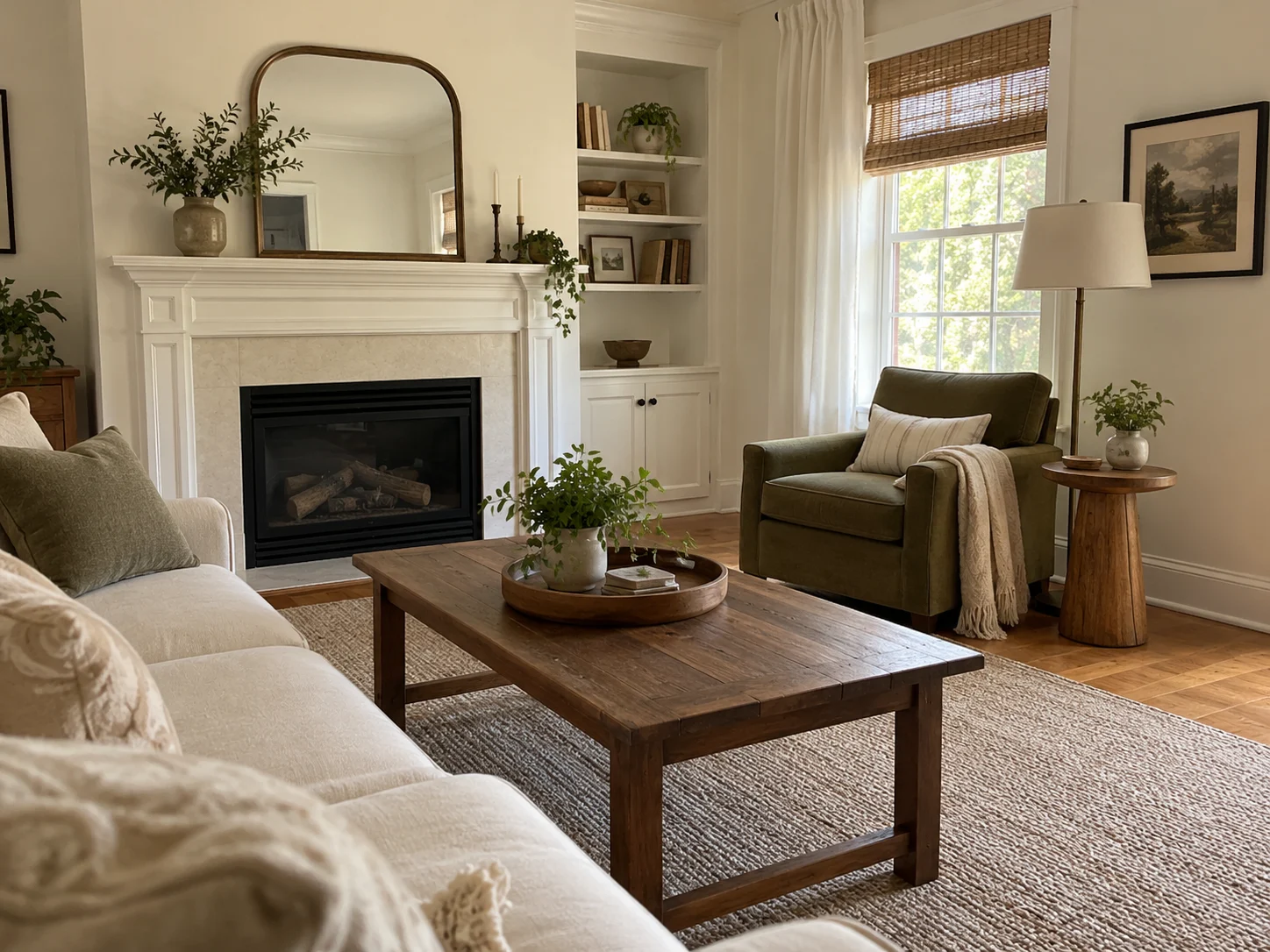
Use this checklist to turn a saved palette into a room that feels connected.
- Identify the colors in the flooring, cabinetry, and largest furniture.
- Choose a palette that works with those existing shades.
- Give background, main, and accent colors clear roles.
- Include a visible difference between light and dark.
- Repeat an accent in more than one place.
- Mix smooth surfaces with woven, grained, or textured materials.
- View the room in daylight and with your usual evening lighting.
- Reuse furniture and accessories wherever they fit.
- Give each new purchase a specific purpose.
Frequently Asked Questions
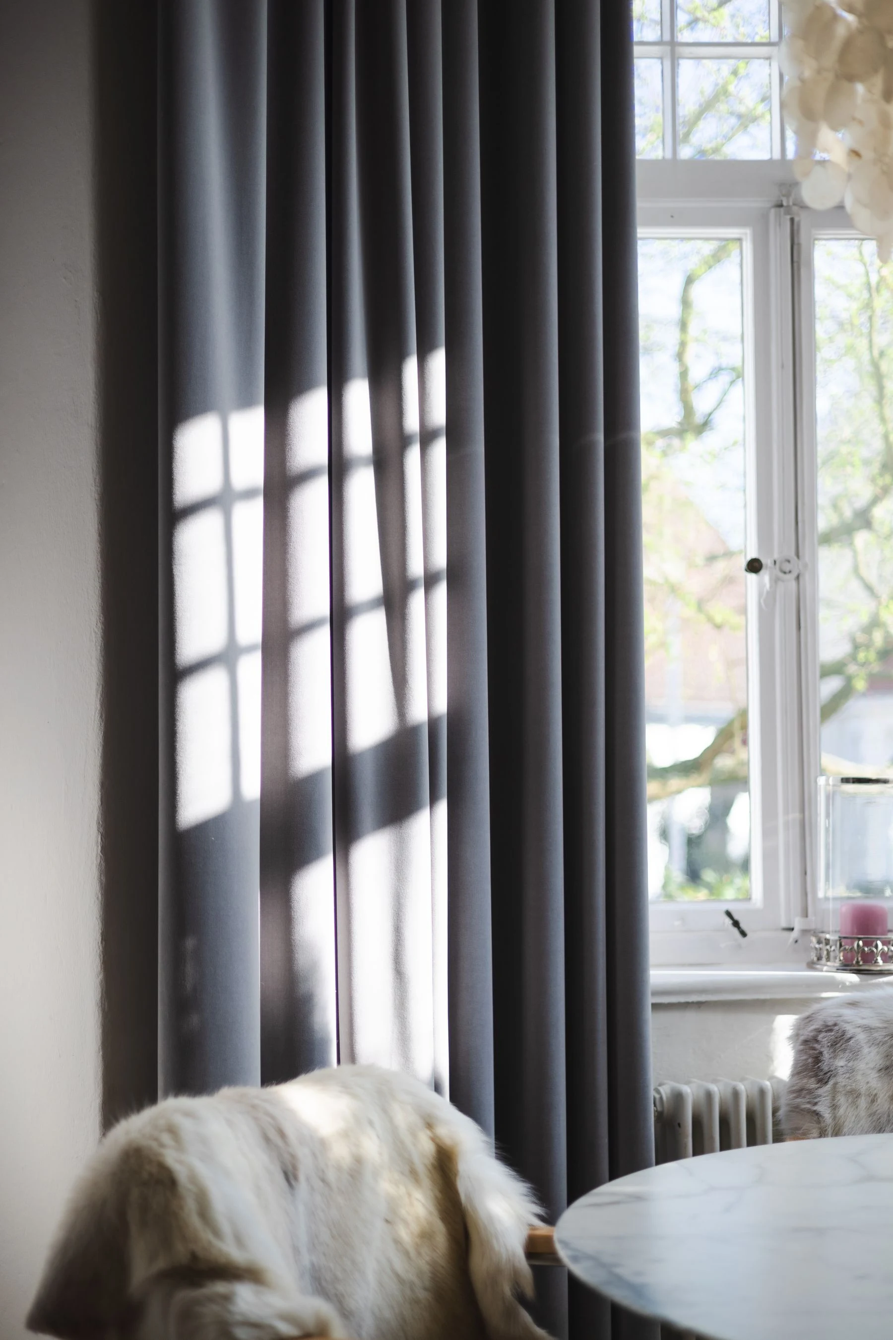
Earth tones can work with gray furniture, black accents, rented walls, and mixed wood finishes. The supporting colors and their proportions make the difference.
Can Gray Work in an Earth Tone Interior?
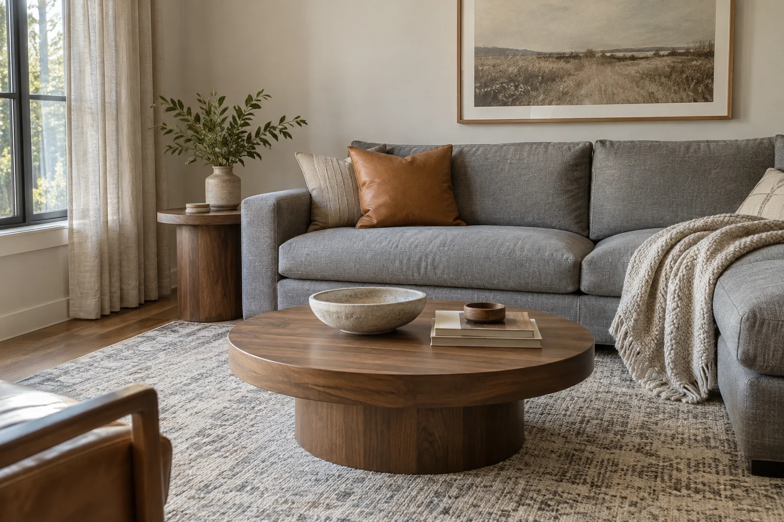
Yes. Gray works with earth tones when the surrounding colors connect it to the room. Stone gray pairs comfortably with cream, wood, and muted green.
For a cooler gray sofa, use tan, walnut, or rust to introduce warmth. Mushroom textiles can soften the transition between the cooler upholstery and warmer accents.
Can an Earth Tone Room Include Black?
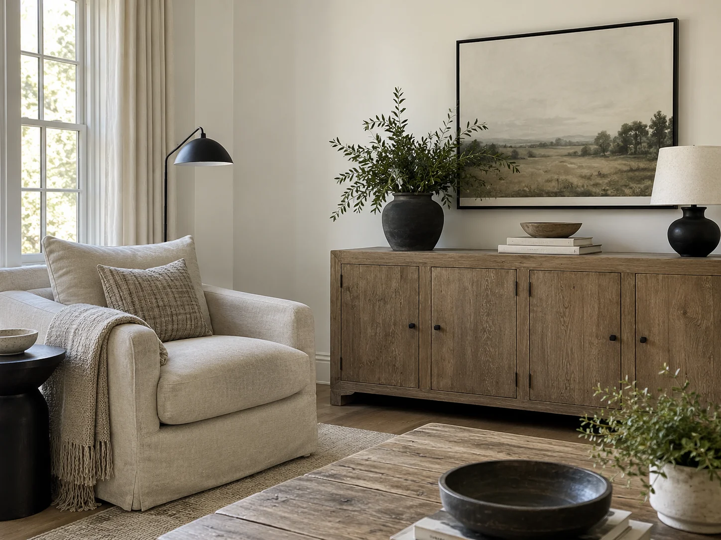
Yes. Black works as a grounding accent in an earthy room. Picture frames, lamp bases, and furniture legs introduce it in smaller amounts.
Repeat black in a few places so it feels connected. If you already own a large black cabinet, give it lighter surroundings and some warm wood or textured fabric nearby.
Which Earth Tone Palette Works With a Brown Sofa?
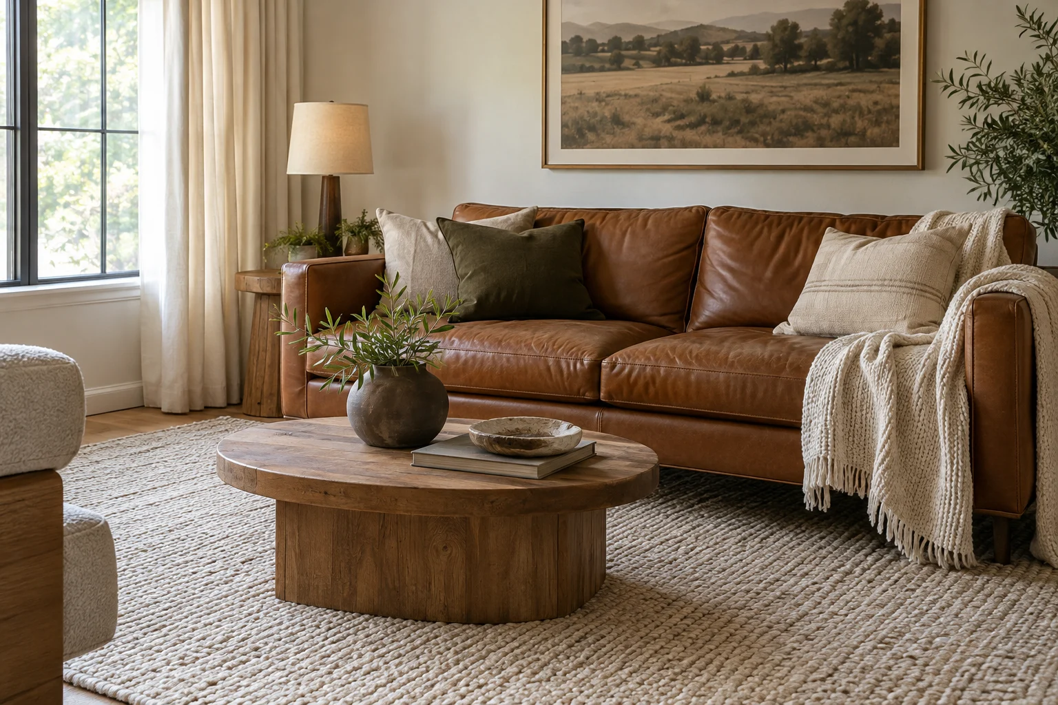
Cream and olive work well with caramel or cognac upholstery; mushroom, ivory, and rust suit deeper brown seating.
Let the sofa remain a major part of the scheme. A pale rug separates it from darker flooring, while cushions bring supporting colors directly onto the upholstery.
For a particularly warm brown sofa, sand and muted terracotta also work, with cream providing a lighter counterpoint.
How Do You Add Earth Tones Without Painting?
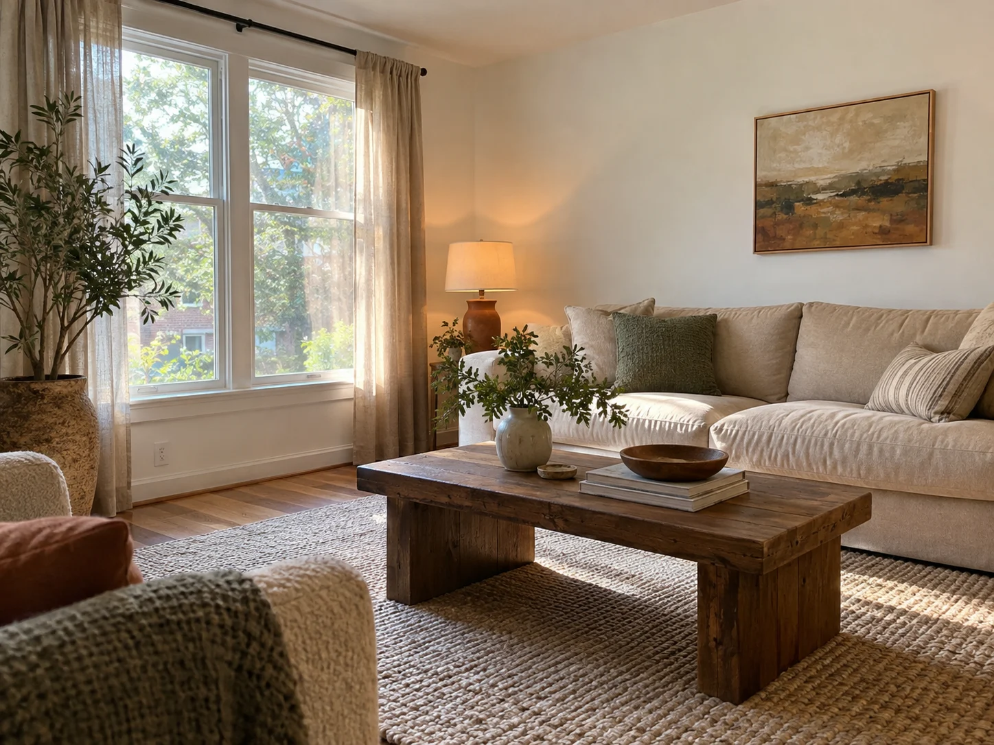
Use textiles, furniture finishes, artwork, and ceramics to carry the palette. Curtains and rugs cover enough space to make a noticeable change.
For a smaller update, add sage cushion covers or a terracotta brown lamp, then repeat that color in a print or another accessory.
White rental walls can remain the light background around the earthy pieces.
Can You Mix Warm and Cool Earth Tones?
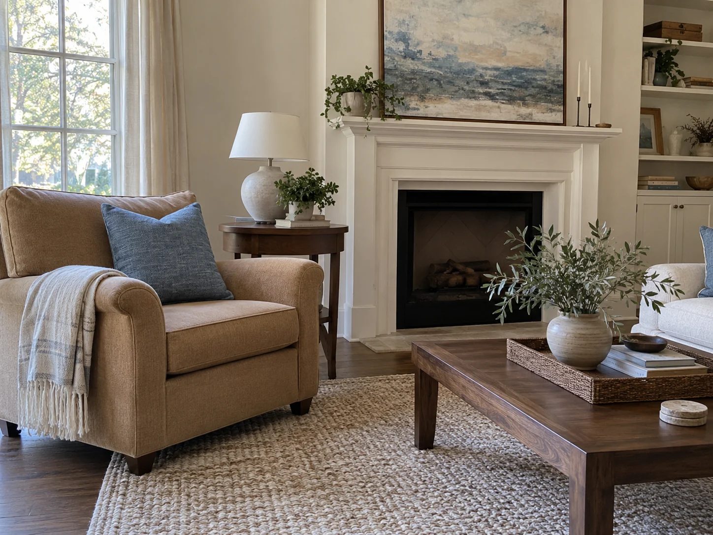
Yes. Muted warm and cool colors work together when their intensity feels balanced and each has a clear role.
Stone blue with tan and walnut is a useful example. The blue introduces a cooler note, while leather and wood keep warmth present.
Repeat the blue through a cushion and artwork, then connect the warmer shades through furniture and smaller wood details.
Shop the Colors and Textures
 Heirloom Traditions ALL-IN-ONE Paint in Simply SageA muted gray-green cabinet and furniture paint for bringing sage into an existing piece.
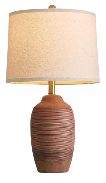 USumkky Terracotta Brown Ceramic Table LampA 24.5-inch ceramic lamp with a linen drum shade for clay-colored warmth beside pale upholstery.
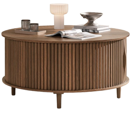 JOINICE 31.5-Inch Round Coffee Table in WalnutA walnut-finish round coffee table with fluted detailing and storage, adding deeper brown to a light seating area.
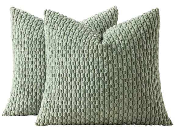 MIULEE Sage Green Corduroy Pillow CoversTwo textured 18-by-18-inch sage covers for existing cushion inserts. Inserts are sold separately.
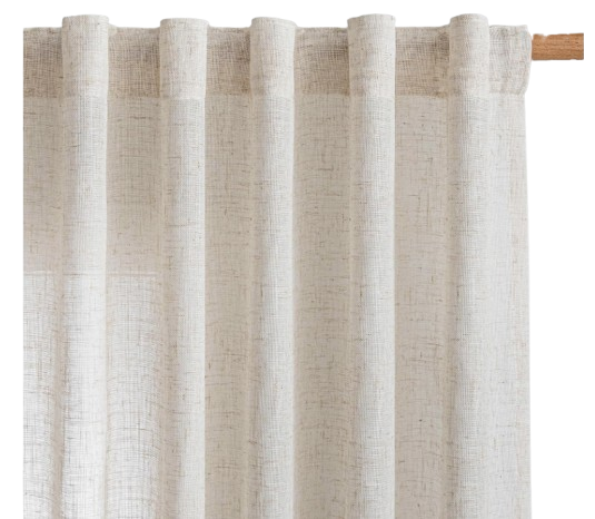 MYSKY HOME Semi-Sheer Linen-Blend CurtainsLight-filtering linen-blend panels in a natural linen shade for a pale woven layer around the window.
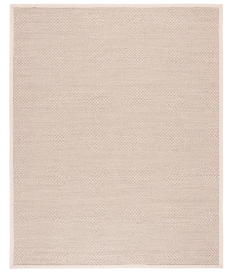 SAFAVIEH Natural Fiber NF143C Rug in Marble and BeigeA neutral sisal rug that adds woven texture beneath leather seating and darker furniture.
 Ravinte Champagne Bronze Square Cabinet HandlesWarm champagne bronze pulls for repeating a metal accent across green, cream, or wood cabinetry.
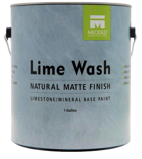 Meoded Authentic Lime Wash Paint in FossilA matte mineral wall finish with softly mottled variation and a weathered, plaster-like appearance.