The Viral Japanese Color Palette Book: 8 Home Decor Ideas Inspired by Sanzo Wada

If you’ve seen people flipping through the viral Japanese book, Sanzo Wada’s A Dictionary of Color Combinations, on your feed, that little book offers a useful way to think about what belongs together. Choosing a home decor color palette feels much easier when you can see the colors side by side.
The quick answer
- Adapt a Sanzo Wada-inspired palette using one main color, one supporting shade, and a smaller accent.
- Try olive, dusty pink, and cream, or powder blue with chocolate brown, through furniture and textiles.
- For a mostly neutral room, use the palette in one corner or a few accessories before adding more color.
You can work around the sofa you already own or give one corner a fresh look. Here’s how to use the book, eight palettes to try, and pieces that help bring them together.
What Is Sanzo Wada’s A Dictionary of Color Combinations?
A small book of colorful possibilities earns its place beside your decorating plans.
It’s a compact collection of 348 color combinations created by Japanese artist and designer Sanzo Wada. His work spanned painting, costume design, and fashion, giving him plenty of ways to explore how colors behave together.
The original collection dates to 1933–1934. Seigensha published the modern edition in 2010, bringing those combinations into the small book you see today.
For decorating, its appeal is straightforward: you can browse colors together without having to picture an entire room first. A shade you usually overlook might suddenly make sense beside something you already love.
Why Does a Book of Color Blocks Help With Decorating?
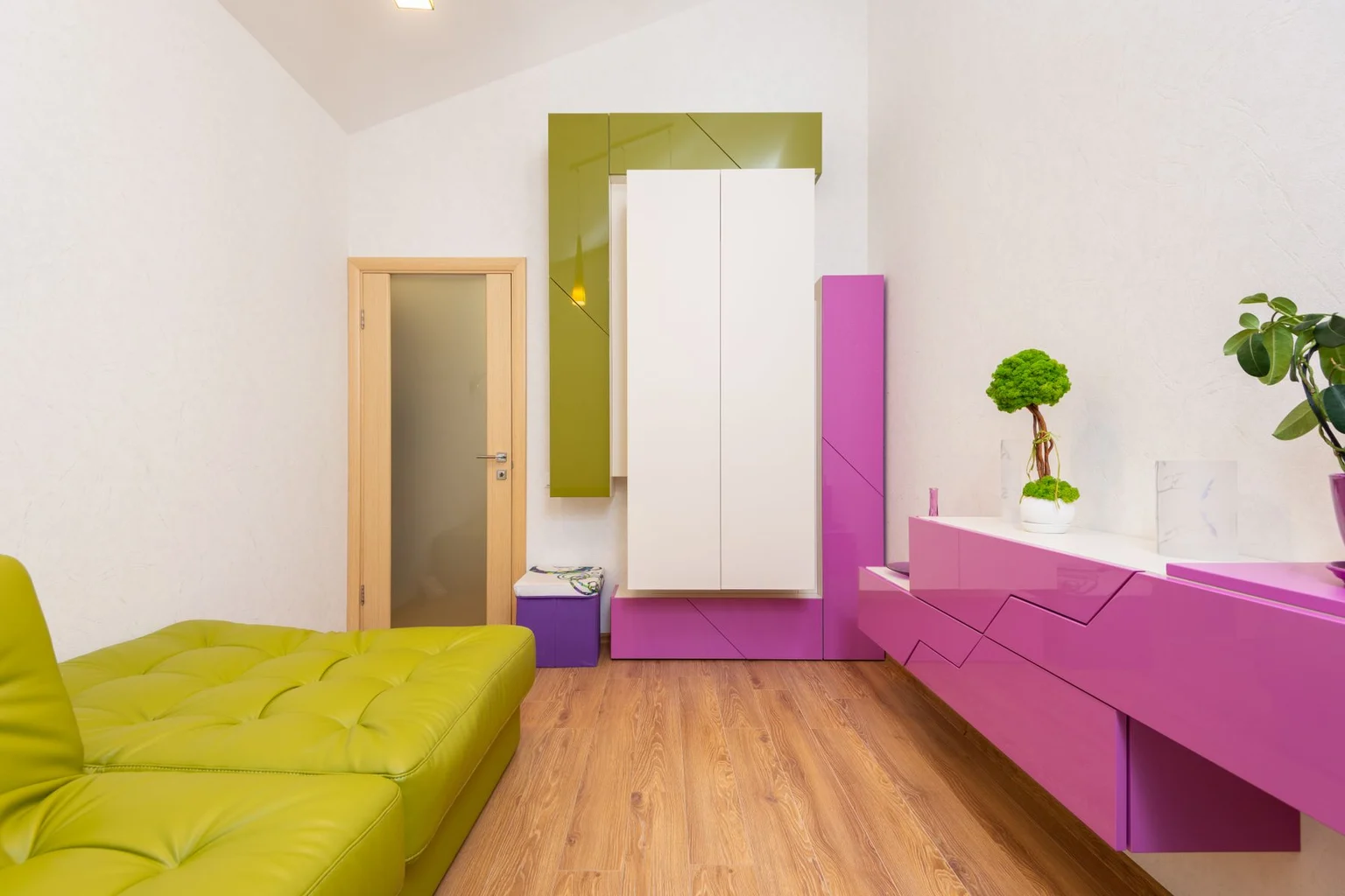
It helps you choose a relationship between colors before buying more things.
You know that moment when the cushions look lovely in the shopping cart, but somehow feel wrong on your sofa? Often, each piece was chosen separately. The room needs a few colors that connect the purchases.
A palette gives you that direction. It can also encourage a combination you might never have tried, such as lavender beside mustard or pale blue against dark brown.
Think of it like planning dinner. Each ingredient can be delicious, but choosing what works together makes the whole meal better.
How to Turn a Color Palette Into a Room
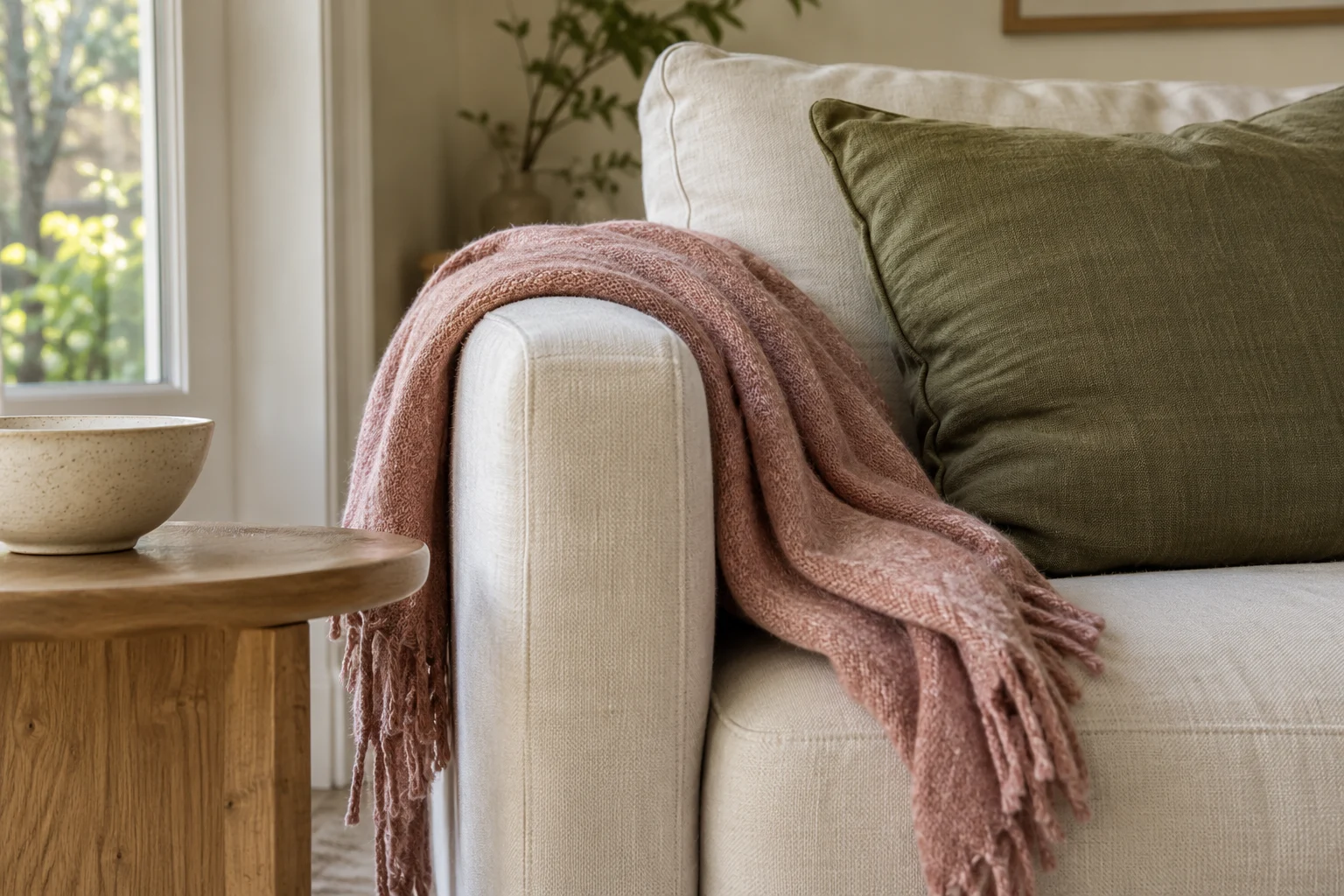
Build around the largest color you’re keeping, then assign the other shades to specific surfaces and objects. Your flooring, cabinetry, curtains, and furniture already contribute color.
A brown leather sofa belongs in the plan. So does a pale oak dresser or a dark blue rug. Working with those pieces makes the update feel connected to your home.
| Color role | Where it can go | Example |
|---|---|---|
| Main color | Walls, a large rug, or a substantial area of upholstery | Warm cream |
| Supporting color | Curtains, bedding, an armchair, or cabinetry | Olive green |
| Accent color | Cushions, lighting, artwork, or ceramics | Dusty pink |
Give the colors different amounts of space. Cream might surround the room, olive might appear on the sofa, and pink might show up in a lamp and a cushion.
The familiar 60–30–10 decorating guideline can help you picture those proportions. It’s a general decorating tool, separate from Wada’s book, and it works best as a loose guide. Nobody needs to calculate the percentage of pink in their living room.
8 Home Decor Color Palettes to Try
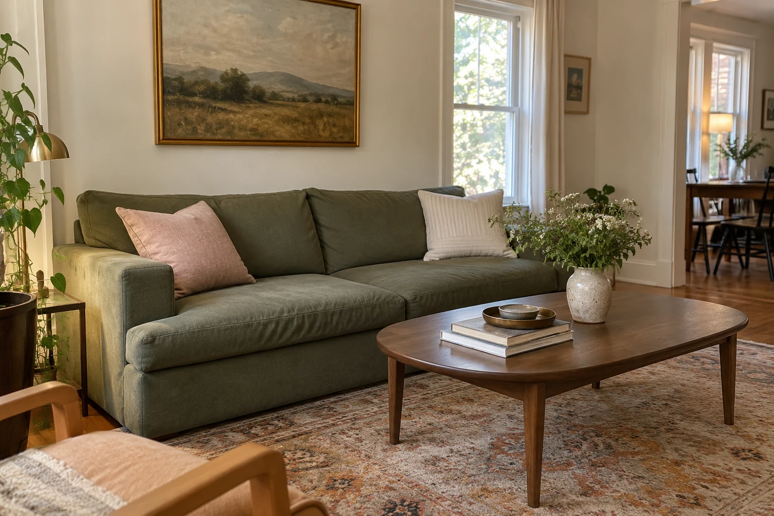
These eight palettes turn the idea of exploring color relationships into practical decorating choices. They are original room suggestions inspired by that approach, rather than numbered combinations reproduced from Wada’s books.
1. Olive, Dusty Pink, and Warm Cream
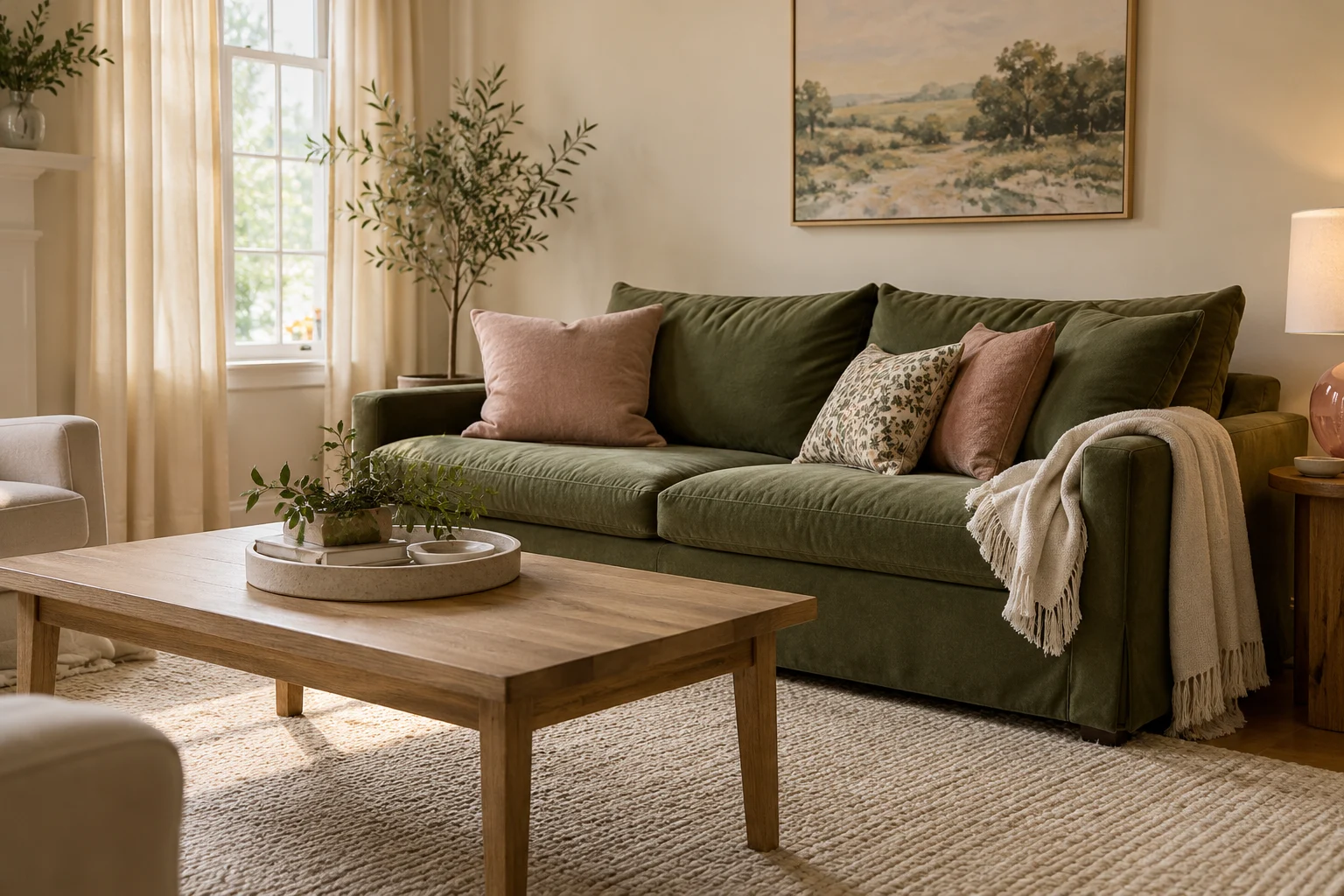
Use olive for the main furniture, cream for the surroundings, and dusty pink for the softer accents. This gives green upholstery a gentle setting while keeping plenty of character.
An olive sofa or chair looks comfortable against cream curtains and an ivory rug. Add the ILLMTW Pink Glass Floor Lamp beside the seating to bring pink above cushion height. Its flower-shaped shades and gold-toned frame give the corner a decorative focal point.
Repeat the pink once in a cushion or a detail in your artwork. Keep the nearby table simple so the lamp has room to show off.
2. Powder Blue, Chocolate Brown, and Butter Yellow
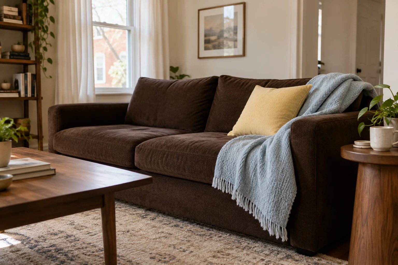
Pair powder blue with chocolate brown, then bring in a small amount of butter yellow. This is a useful combination when your dark furniture is staying but the room needs a lighter touch.
Drape the Smoofy Light Blue Bubble Throw over a brown sofa or across a bed with a dark wooden frame. The raised faux-fur texture makes the pale blue noticeable even when the rest of the room stays fairly simple.
Finish with a butter-yellow cushion or ceramic lamp. One clear yellow accent is enough to make the combination feel deliberate.
3. Terracotta, Muted Teal, and Oatmeal
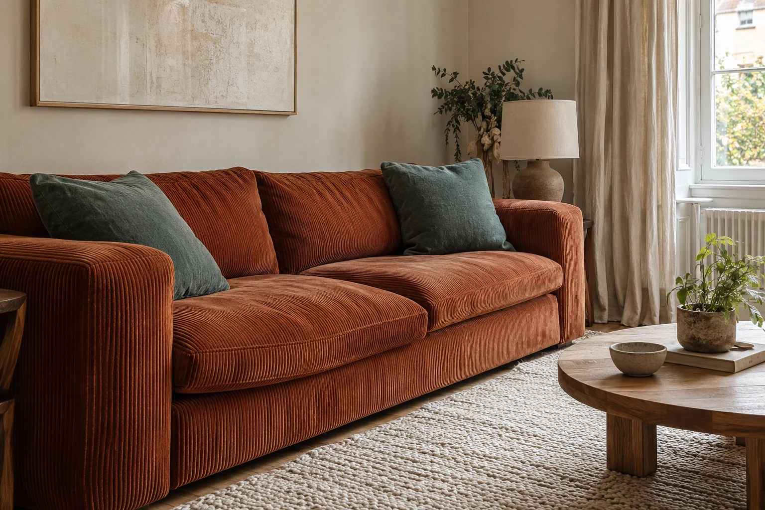
Let terracotta provide warmth, use teal for contrast, and give both colors plenty of oatmeal around them. Pale curtains and a neutral rug help a strong furniture color feel at home.
The MoonSpeak Boneless Futon Sofa Bed in Rust Red brings a related earthy rust shade into this scheme. Its corduroy upholstery adds texture, while a teal cushion or framed print supplies the cooler companion.
Keep the other large surfaces quiet so the sofa remains the focal point. For more on this relaxed seating style, see our guide to viral bubble sofas and rounded alternatives.
4. Burgundy, Blush, and Pale Oak
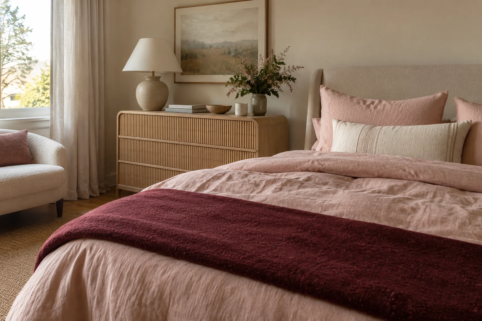
Use blush for softness, pale oak tones for warmth, and burgundy to give the room some depth. A bedroom is an easy place to try this combination.
The Decofy Natural Oak Six-Drawer Dresser adds a light oak look with fluted drawer fronts. Pair it with blush bedding and a burgundy throw folded across the foot of the bed.
A cream lamp on the dresser keeps the arrangement calm. You don’t need pink accessories on every surface when the bedding already carries that color.
5. Sage, Rust, and Soft White
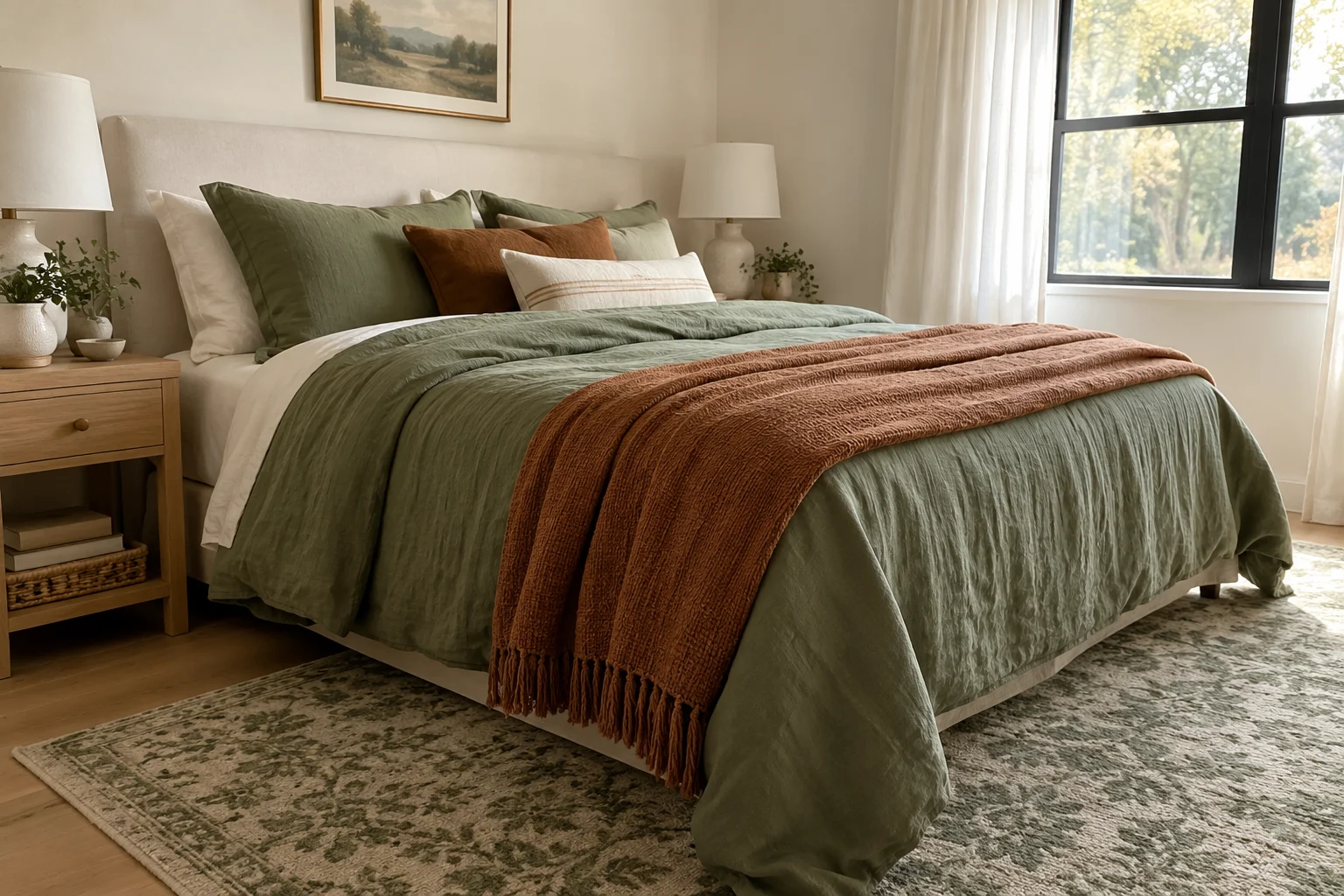
Let sage create the gentle background, use rust as the warm accent, and keep soft white visible between them. The combination works well in a bedroom or a relaxed living room.
The Ophanie Green and White Area Rug brings green onto the floor through a softly varied pattern. Pair it with sage bedding or cushions, then add a rust throw, lampshade, or ceramic vase.
Wood furniture fits comfortably alongside these colors. If this is your favorite direction, our earth tone interior color palettes offer more ways to combine greens, browns, and warm accents.
6. Lavender, Mustard, and Walnut
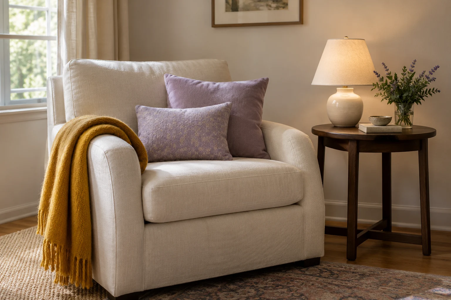
Keep lavender soft, mustard limited, and walnut furniture visible. The darker wood gives the two colors a steady background.
Try the HPUK Lavender Mist Pillow Covers on a cream sofa beside a walnut side table. The set includes two 18-by-18-inch covers, making it easy to repeat lavender across the seating.
A mustard throw or lampshade completes the trio. If the pairing feels bold, keep the colorful pieces together in one reading corner and let the rest of the room stay quieter.
7. Deep Blue, Coral, and Ivory
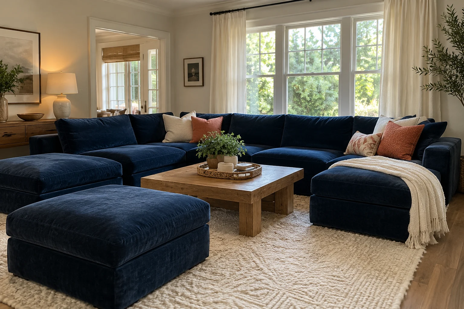
Use deep blue for the largest furniture piece, ivory for the lighter surroundings, and coral as the accent. This gives the room a clear focal point without requiring several competing furniture colors.
The CDCASA Blue Modular Sectional makes blue a substantial part of the room. Its chenille upholstery and two movable ottomans create a seating arrangement you can balance with an ivory rug and pale curtains.
Add coral through a cushion or artwork. A faded coral feels softer, while a brighter shade creates a sharper contrast against the blue.
8. Moss Green, Golden Ochre, and Charcoal
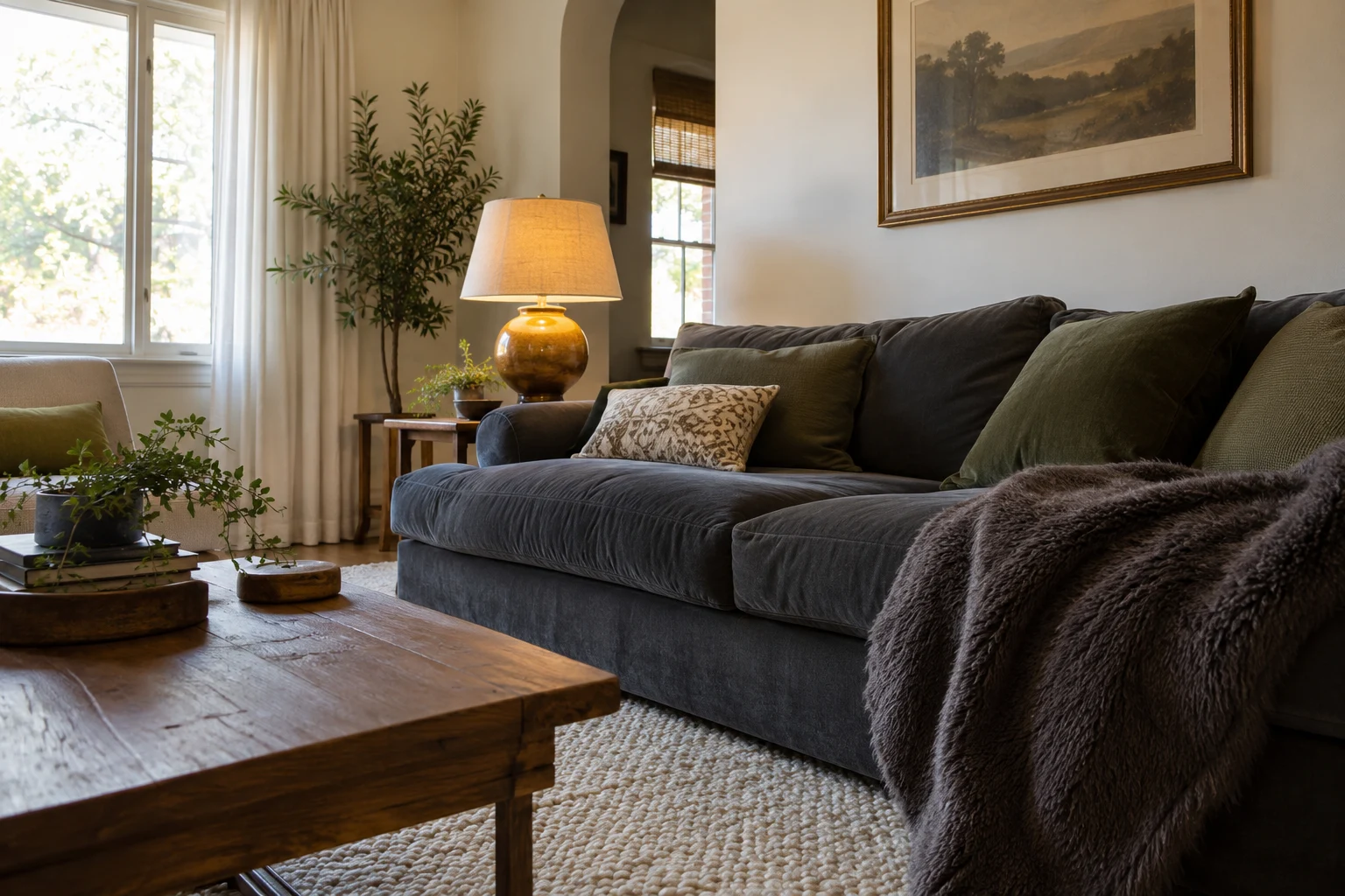
Keep charcoal as the darker foundation, then add moss green and golden ochre through textiles and lighting. This is a practical way to refresh a gray sofa without replacing it.
Try moss-colored cushions, an ochre lampshade, and the blunique Bubble Throw in Dark Grey Taupe. Its warmer gray-taupe shade adds another neutral layer, while the raised texture gives the sofa some variety.
Keep a light surface nearby, such as pale walls or an ivory rug. That separation helps the darker pieces remain distinct instead of blending into one heavy-looking area.
Prefer a Mostly Neutral Home? Give One Corner the Color
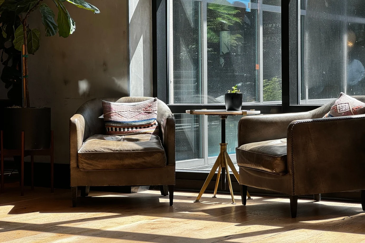
Use the combination in a smaller arrangement while keeping the larger room neutral. A reading corner, bedside table, or console is enough space to explore the idea.
Olive and pink might become a green chair beside a pink lamp. Lavender and mustard could appear on a cream sofa with a walnut table nearby.
This works particularly well when you already like the room and simply want something fresh. You can enjoy the color relationship without changing every surface.
For more warm wood, comfortable seating, and layered fabrics, browse our Nancy Meyers aesthetic ideas.
Why Does the Same Color Look Different at Home?

Light, material, and scale change how a color appears. A small blue block on a page will have a different effect from blue curtains covering most of a wall.
Pink glass catches highlights. Corduroy has shadows between its ribs. A fluffy throw reflects light differently from a smooth painted cabinet. Those differences can make related shades feel interesting together.
Use physical paint and fabric samples in the room before committing to large surfaces. View them in daylight and under the lamps you normally use at night.
Note: Printed swatches and screen colors help establish a direction. They aren’t exact paint formulas or guaranteed fabric matches.
Which Sanzo Wada Book Belongs on Your Shelf?
Two compact books offer different routes into color.
Choose Volume 1 for the original collection, then add Volume 2 when you want to explore seasonal and historical combinations.
A Dictionary of Color Combinations, Volume 1 contains the original collection of 348 combinations. It’s a useful first purchase if you want to browse color pairings and apply them to rooms, outfits, or creative projects.
A Dictionary of Color Combinations, Volume 2 explores combinations connected to Japanese seasons and historical examples from fashion, interiors, and graphic design. It gives you more material to explore once you’ve found the approach helpful.
You don’t need to turn every page into a decorating project. A single combination that helps you finish an awkward room can make the book useful.
A Quick Checklist Before You Shop
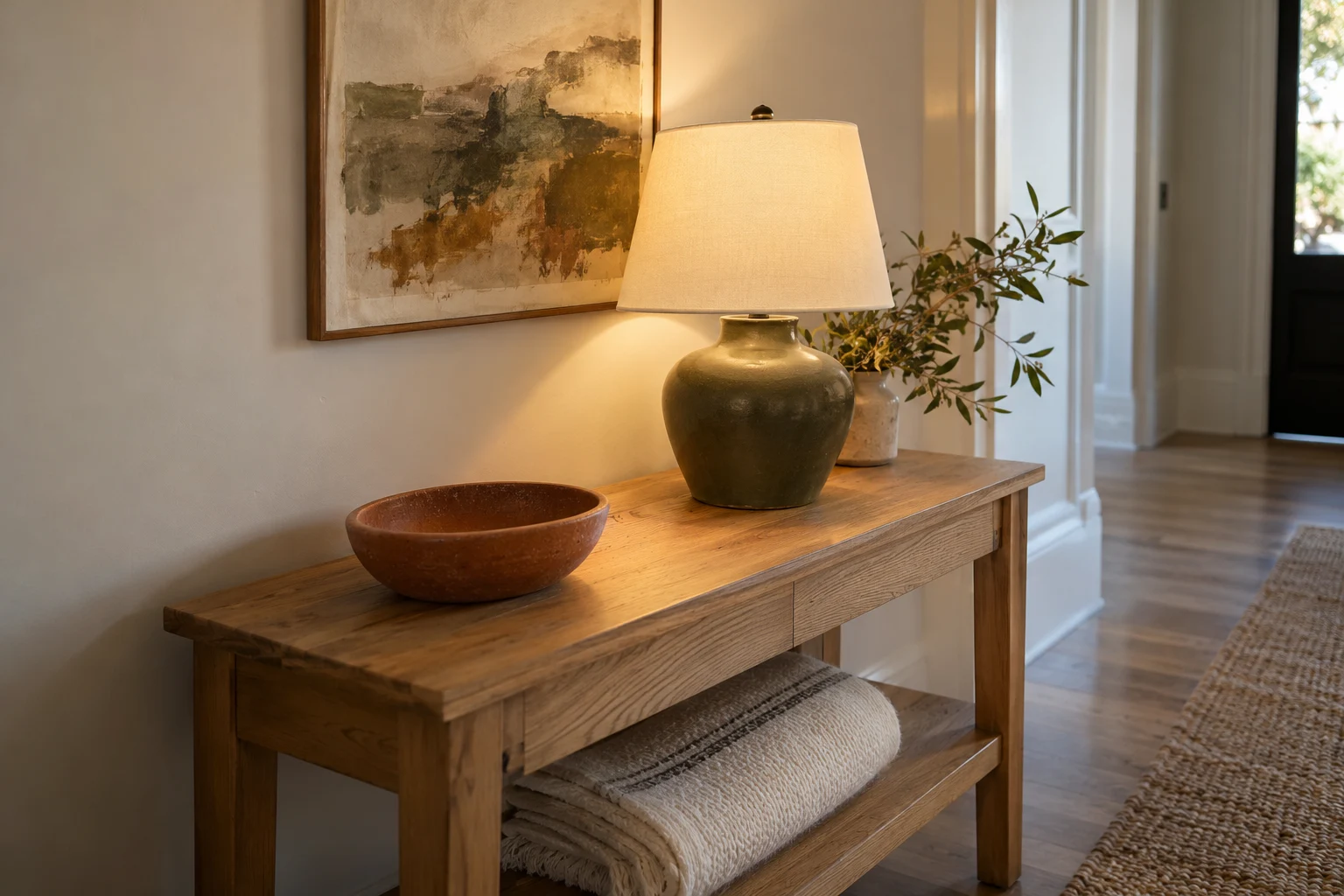
Buy the piece that fills a gap in your room’s color scheme. If you already have the main and supporting colors, a smaller accent may be all that’s missing.
- Identify the largest colors you’re keeping.
- Include flooring, cabinetry, and wood furniture in the plan.
- Choose one shade to take the most visual space.
- Assign supporting colors to specific objects or surfaces.
- Keep the strongest accent in a smaller area initially.
- Repeat a color in another part of the room when it needs a connection.
- Mix textures so similar shades don’t feel flat.
- View physical samples before buying large upholstery or repainting.
- Add one useful piece, then assess the room before buying more.
Frequently Asked Questions
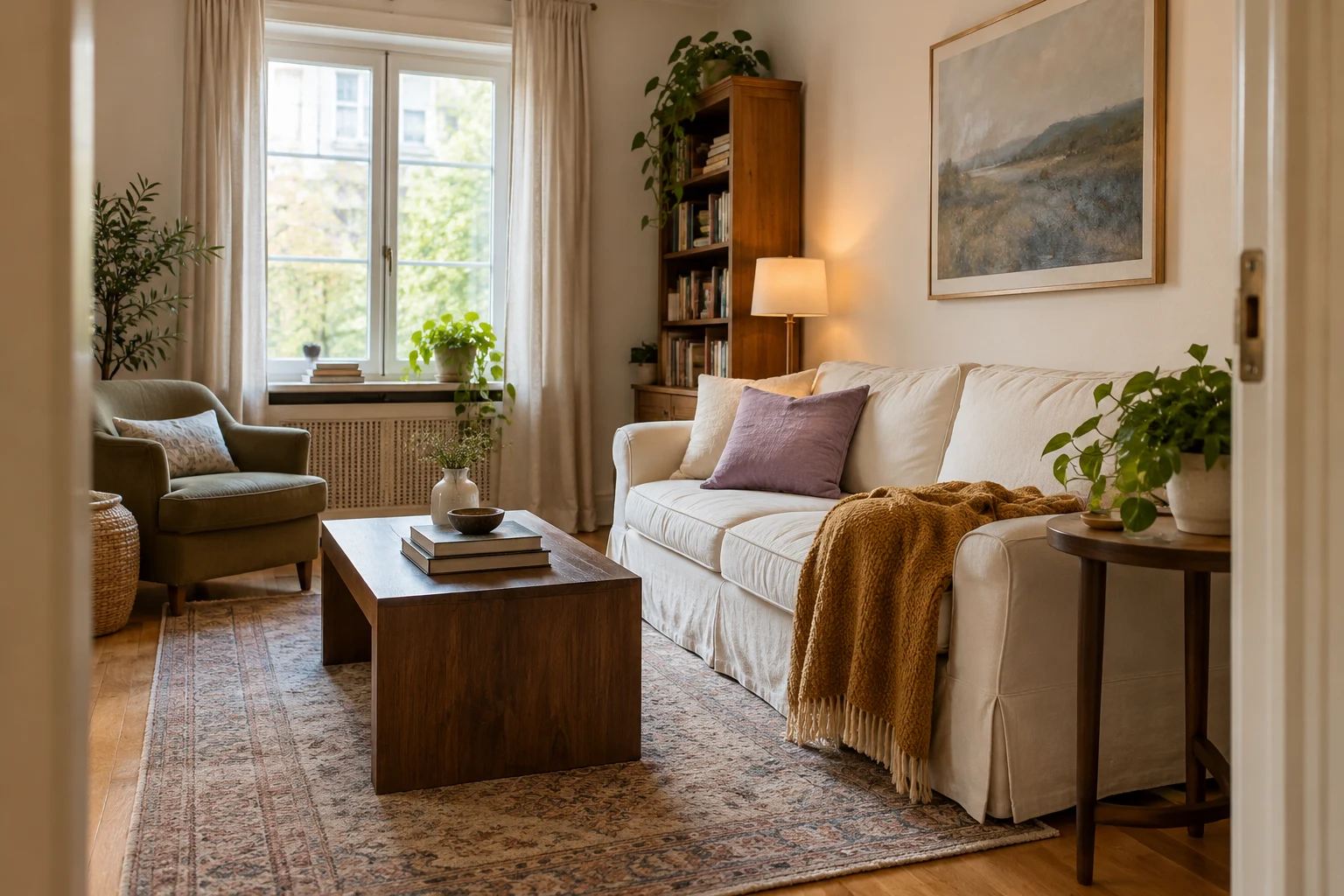
Can You Use Sanzo Wada’s Book for Interior Design?
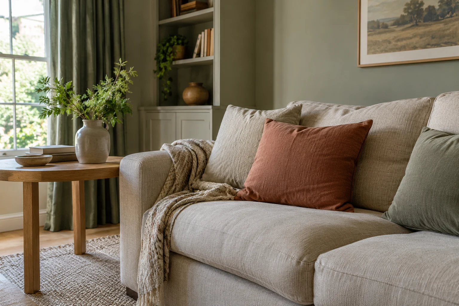
Yes. Use the colors to guide your choice of paint, furniture, textiles, and accessories. You’ll decide the proportions, materials, and placement according to your room.
Connect one shade to something you already own, then give the remaining colors a specific role. That makes the palette easier to use.
Do You Have to Use Every Color in a Combination?
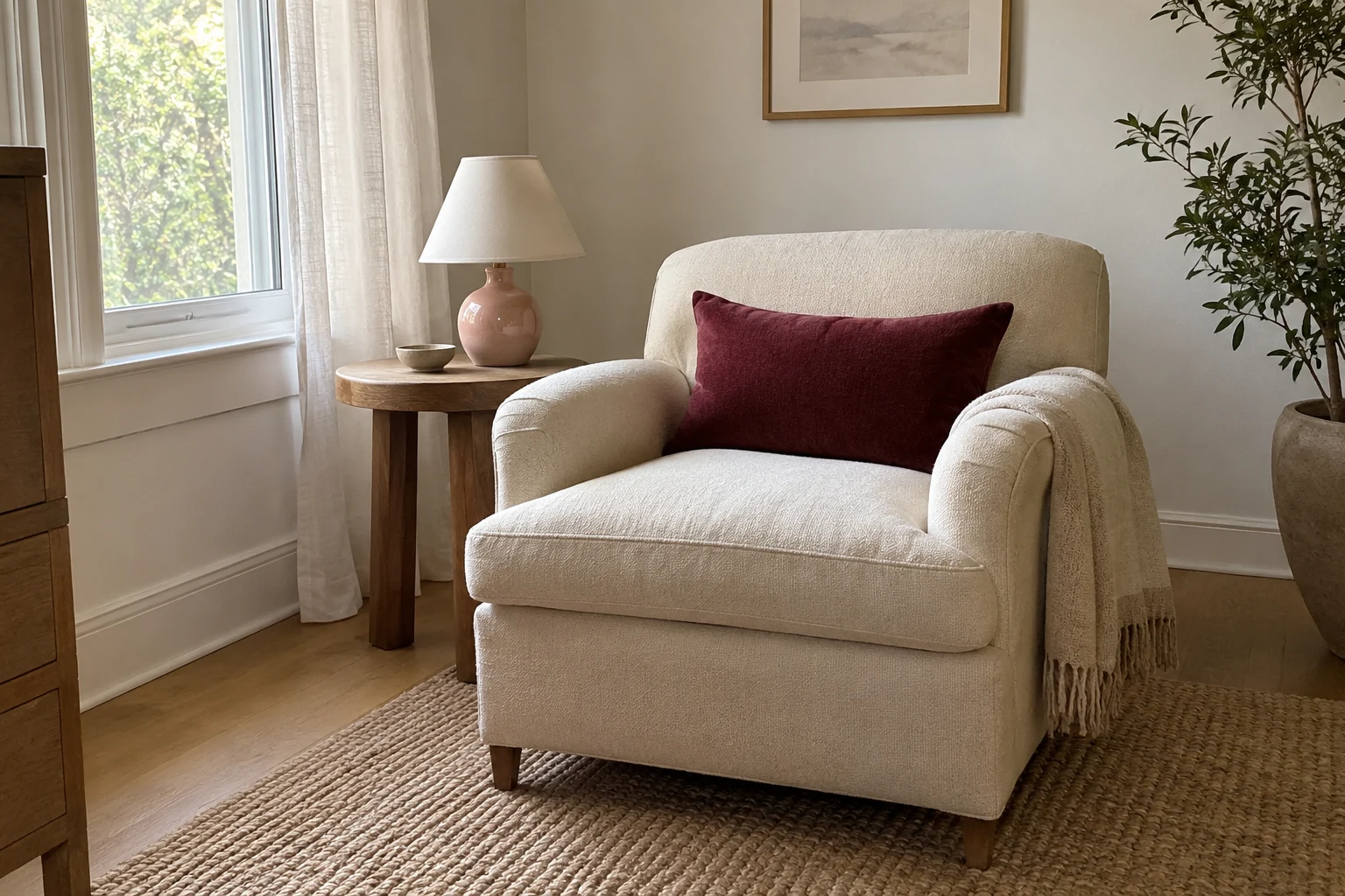
No. You can adapt the combination to suit your space. A strong color might appear only in a lampshade, while a quieter shade covers the walls.
If the combination contains more colors than you want to use, borrow the pair that appeals to you most. Keep the relationship that drew you to it.
Can You Use These Palettes Without Painting?
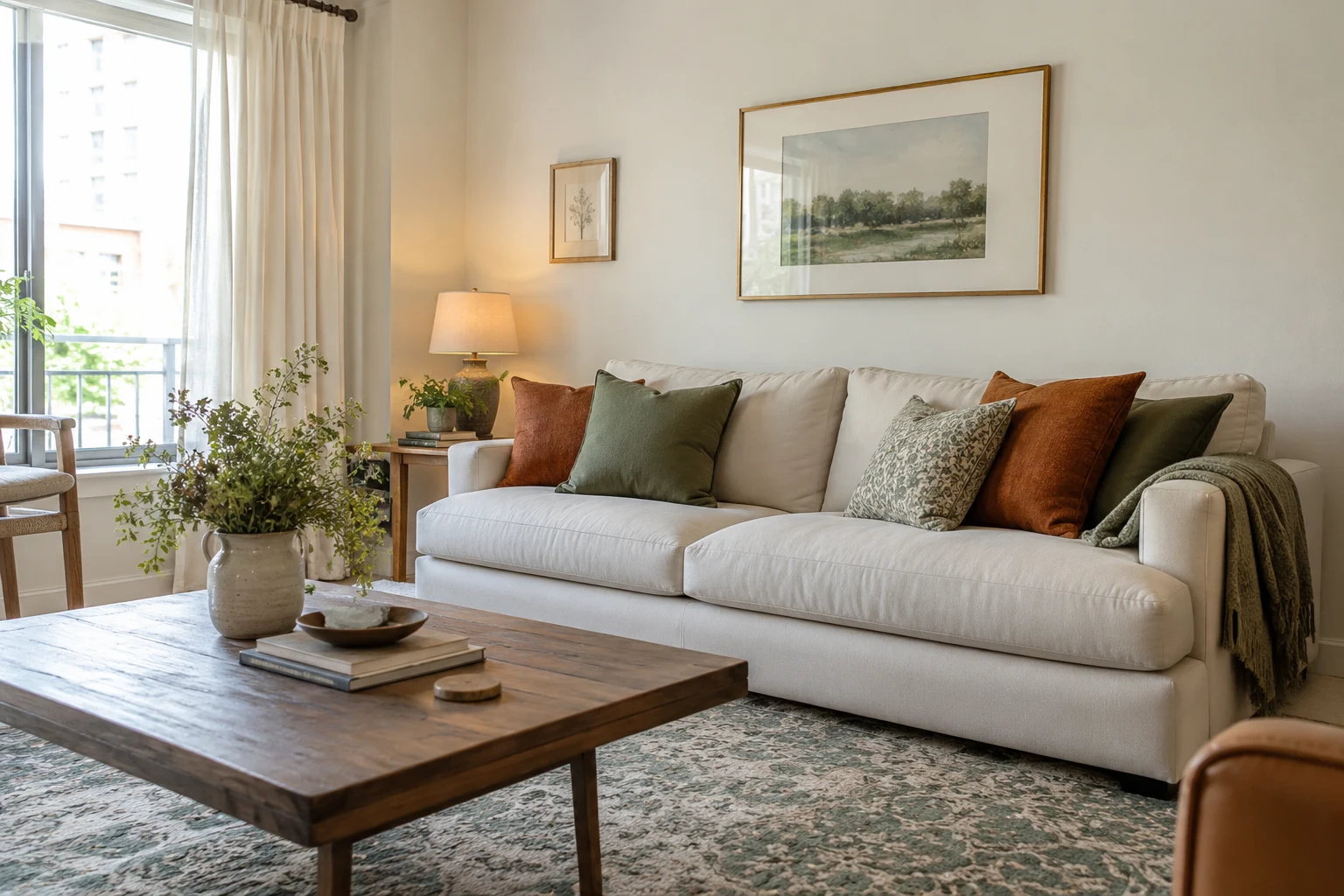
Yes. Furniture and textiles can establish the entire scheme. A rug can introduce green, a throw can repeat it, and a rust-colored lamp can provide the accent.
This is especially useful in rentals or rooms where you already like the wall color.
How Many Colors Should You Use in One Room?
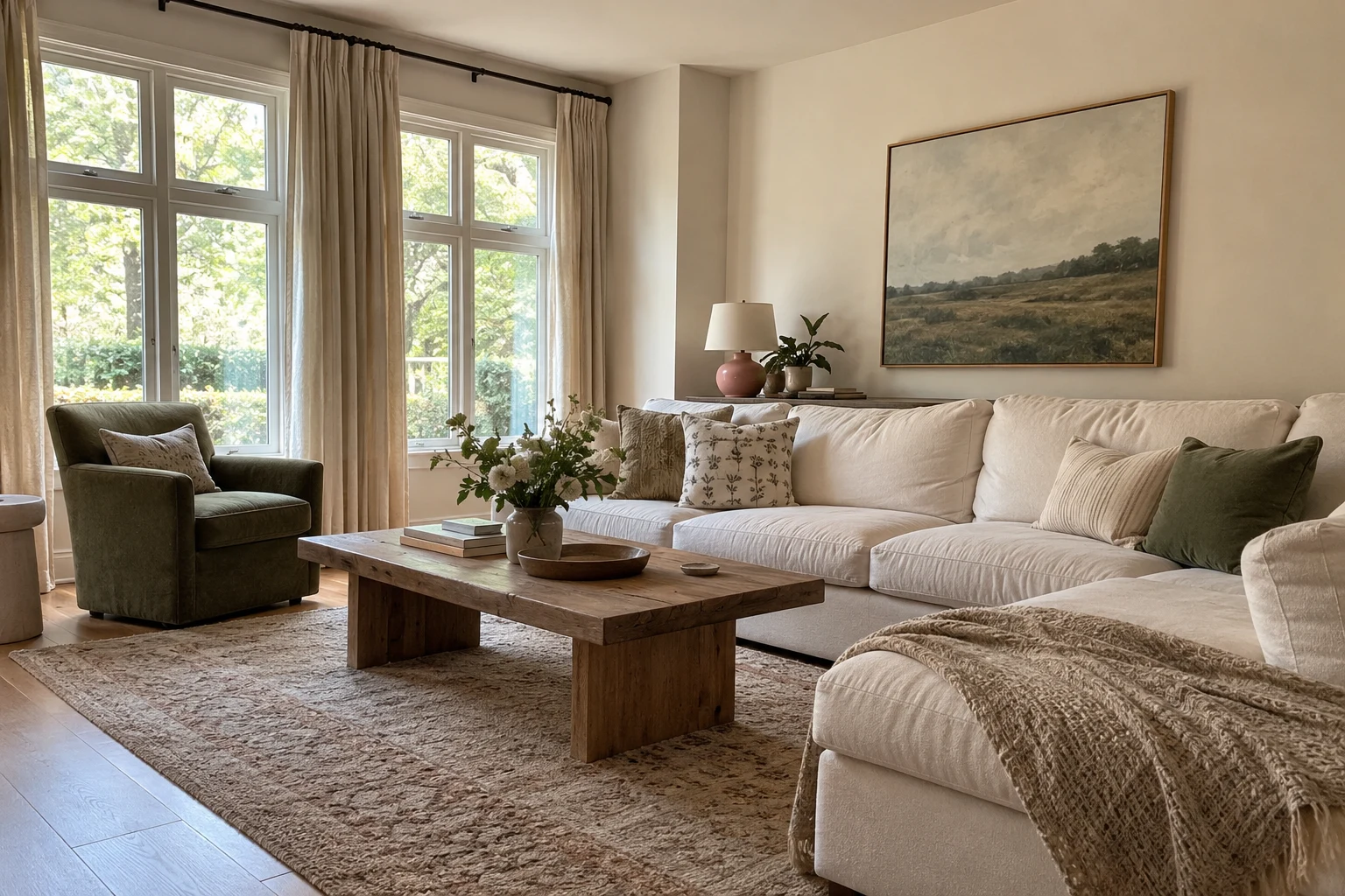
Three main colors make a manageable framework: one dominant shade, one supporting shade, and one accent. Wood, metal, plants, and small variations can sit alongside them.
You don’t need to remove every object that falls outside those three colors. The goal is to make the main choices feel connected.
Do the Products Need to Match the Book’s Colors Exactly?
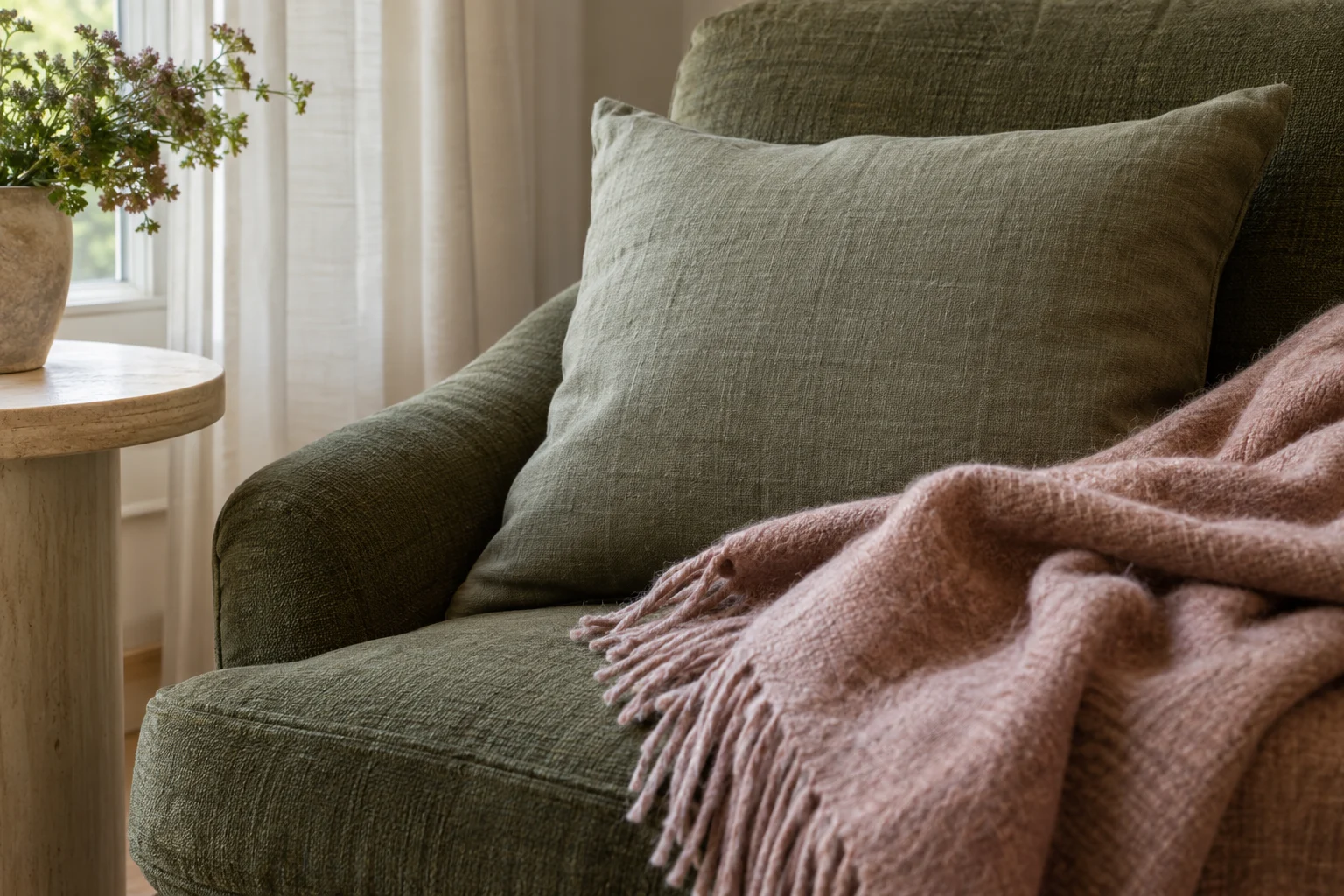
No. Aim for a similar relationship between the colors and judge the actual pieces together. A muted green and dusty pink can work across several shades.
Keep an eye on the balance of light and dark, along with how much space each color occupies. Those decisions have a bigger effect on the room than an exact match to a printed swatch.
Can You Mix Two Palettes in an Open-Plan Room?
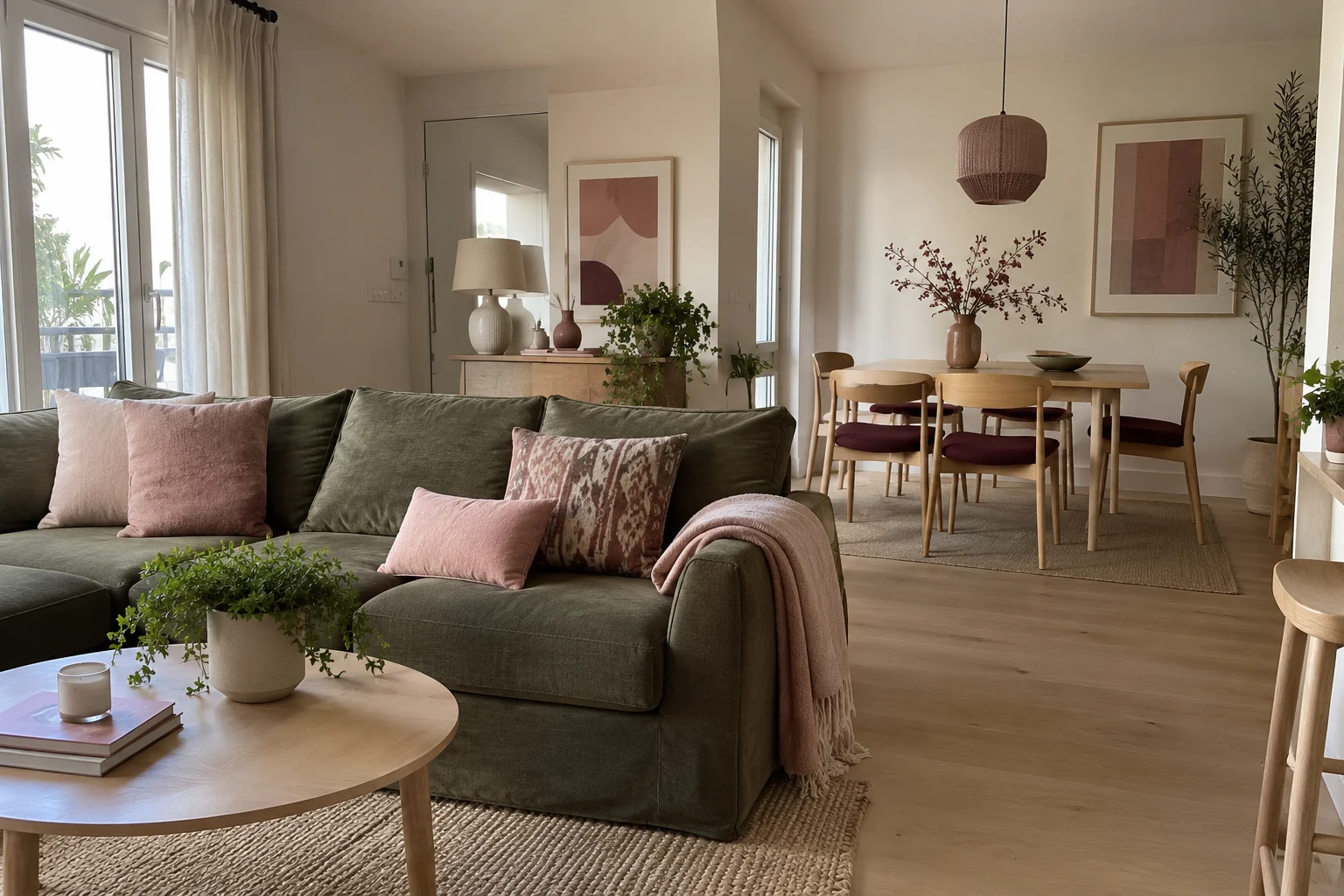
Yes. Repeat at least one main color or material across the two areas. That gives your eye a connection as it moves through the space.
For example, a living area with olive, pink, and cream can sit beside a dining area with burgundy, blush, and pale oak. Cream walls, related pink tones, and repeated wood finishes help the spaces belong together.
Shop the Palette
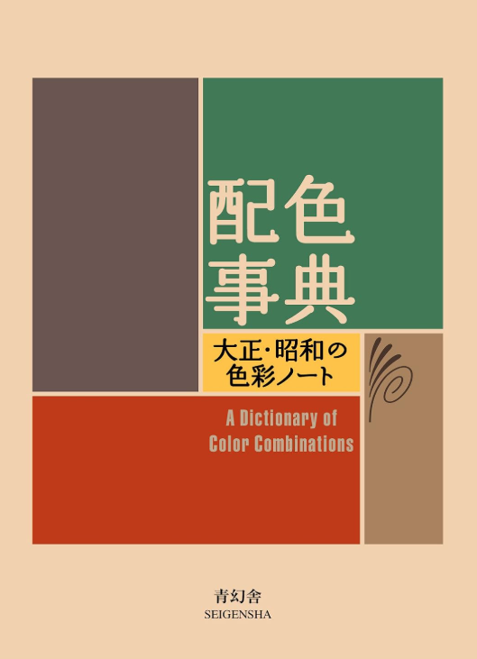 A Dictionary of Color Combinations, Volume 1Sanzo Wada’s compact collection of 348 color combinations offers inspiration for furniture, textiles, paint, and smaller decorative details.
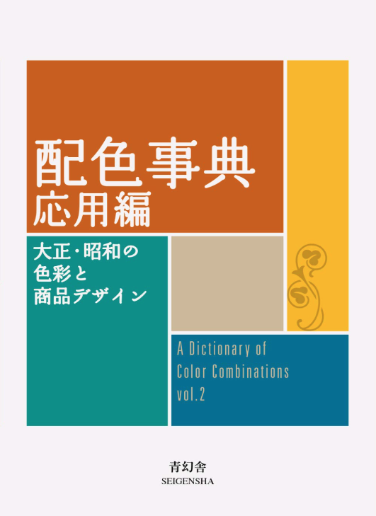 A Dictionary of Color Combinations, Volume 2Explore more combinations connected to Japanese seasons and historical fashion, interiors, and graphic design.
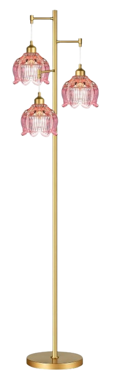 ILLMTW Pink Glass Floor LampPink flower-shaped glass shades and a gold-toned frame add a decorative accent beside olive seating and cream textiles.
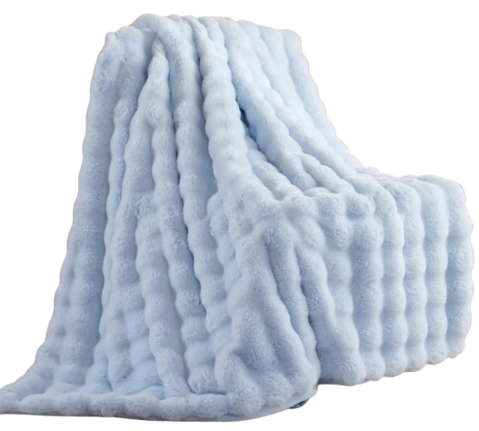 Smoofy Light Blue Bubble ThrowA light blue faux-fur throw brings raised texture to a room with chocolate brown furniture and butter-yellow accents.
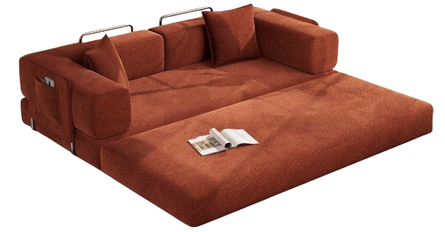 MoonSpeak Boneless Futon Sofa Bed in Rust RedRust-red corduroy upholstery adds earthy warmth alongside muted teal accessories and oatmeal surroundings.
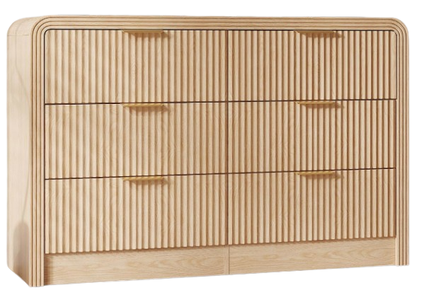 Decofy Natural Oak Six-Drawer DresserA light oak look and fluted drawer fronts provide a warm backdrop for blush bedding and burgundy details.
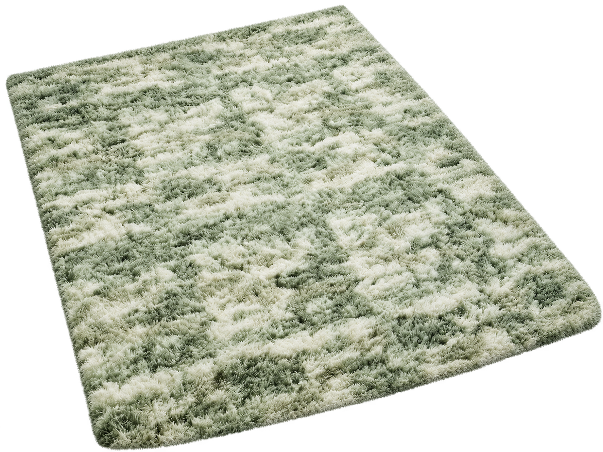 Ophanie Green and White Area RugA softly patterned green-and-white rug carries color onto the floor beside sage textiles and rust accents.
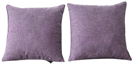 HPUK Lavender Mist Pillow CoversTwo 18-by-18-inch pillow covers introduce lavender beside mustard accessories and walnut furniture.
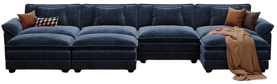 CDCASA Blue Modular SectionalA blue chenille sectional with two movable ottomans anchors a living room with ivory surfaces and coral accents.
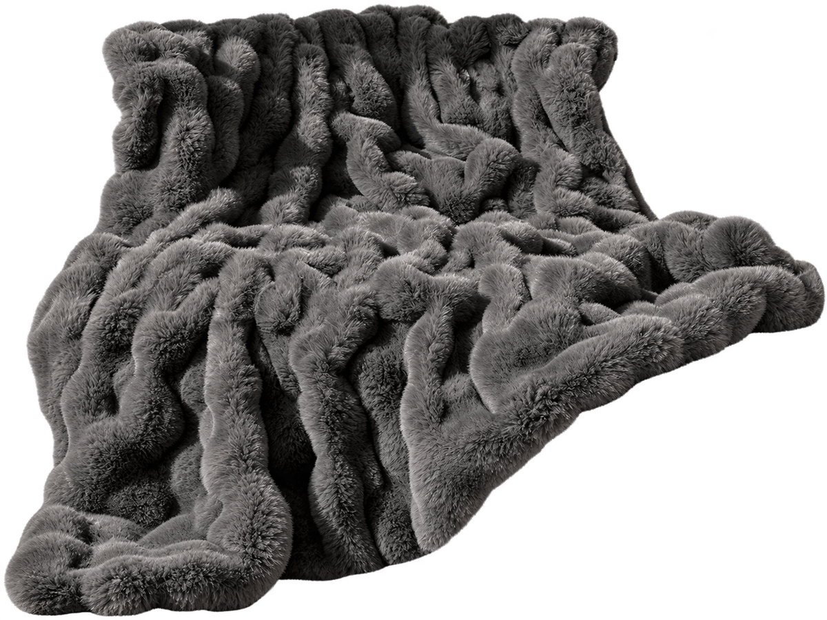 blunique Bubble Throw in Dark Grey TaupeA textured faux-fur throw adds a warm gray layer to charcoal furniture, moss-green cushions, and ochre details.